Table of Contents
Data Visualization: The Secret Weapon of Successful Digital Marketers
Implementing impactful data visualization in digital marketing reports is key, though often anxiety-inducing. This is the pivotal moment when all trend analysis, campaign management and strategy culminate before client scrutiny. Despite undertaking exhaustive digital marketing work, a report failing to impress risks diminishing perceived effort.
While accurately displaying performance data compared to goals remains paramount, how insights are visually presented frequently determines client takeaways. Suboptimal data visualization choices could hinder conveying your digital marketing efficacy.
This blog shares ideal visualization types to help ensure your hard work receives deserved recognition. Carefully crafted charts and graphs ready clients to be wowed when revealed during presentations. This guide will explore the growing impact of data visualization in digital marketing. As marketing data visualization tools make insights more accessible, data-driven decisions become faster.
Keep reading to unlock data visualization best practices for modern digital marketing.
“Vibrant data visualisations not only facilitate comprehension of analytics but capture interest to get key messages across.”
What is Marketing Data Visualization?
Data visualization in digital marketing refers to the practice of translating raw data into visual graphics and representations that make complex information easier to quickly grasp and interpret.
In a marketing context, data visualization might involve taking large datasets from platforms like Google Analytics or social media analytics tools and presenting that quantitative information through charts, graphs, and other visual formats.
This serves to not only summarize marketing data in a more accessible way but spotlights the most actionable insights. A data visualization can eloquently communicate the key takeaways from campaign performance, audience engagement metrics, competitive benchmarking, and more.
For marketing teams and agencies struggling to synthesize vast amounts of data to measure effectiveness and optimize spending, data visualizations provide clarity. The right visuals distill volumes of raw data down to the most essential points. This enables better and faster decision making backed by data.
From social media managers monitoring performance across platforms to analysts reporting on multichannel campaigns, integration marketing and beyond – unlocking meaning from data is a core competency. This is precisely why data visualization needs to be in every modern marketer’s toolkit.
Vibrant data visualizations not only facilitate comprehension of analytics but capture interest to get key messages across. They provide an aesthetically engaging medium to showcase marketing data. The versatility of data visualizations also allows repurposing across presentations, client reports, internal communications, and even external content marketing.

Actionable Value of Data Visualization in Marketing
With data visualization unlocking clearer insights faster, it holds incredible power for immediately improving digital marketing efforts such as:
- Pinpointing high-performing campaigns, ad sets and creatives to allocate more spending towards what demonstrably works.
- Discovering untapped audience segments that convert at higher rates to refine targeting and personalization.
- Tracking engagement rates over time to determine optimal social posting cadences per platform.
- Monitoring web traffic sources to double down on visitor acquisition channels with diminishing returns.
- Comparing performance across platforms and campaigns to shift budgets to better optimize results.
- Correlating landing page design elements with conversion rates to continuously refine page layouts and content.
- Identifying messaging resonance with demographic groups to fine-tune communication.
- Leveraging competitor benchmarking data to target areas of opportunity and differentiation.
Equipped with freshly visualized performance data translated into action steps, digital marketing teams waste no time implementing changes expected to directly improve KPIs from channel revenue to audience growth.
The on-demand availability of visualization dashboards allows for adjustments rooted in real-time data, not hunches. This strategy powered by meaningful measurement guides better consumer experiences driving branding and direct response objectives alike.
Data Visualization Types
1. Scorecards
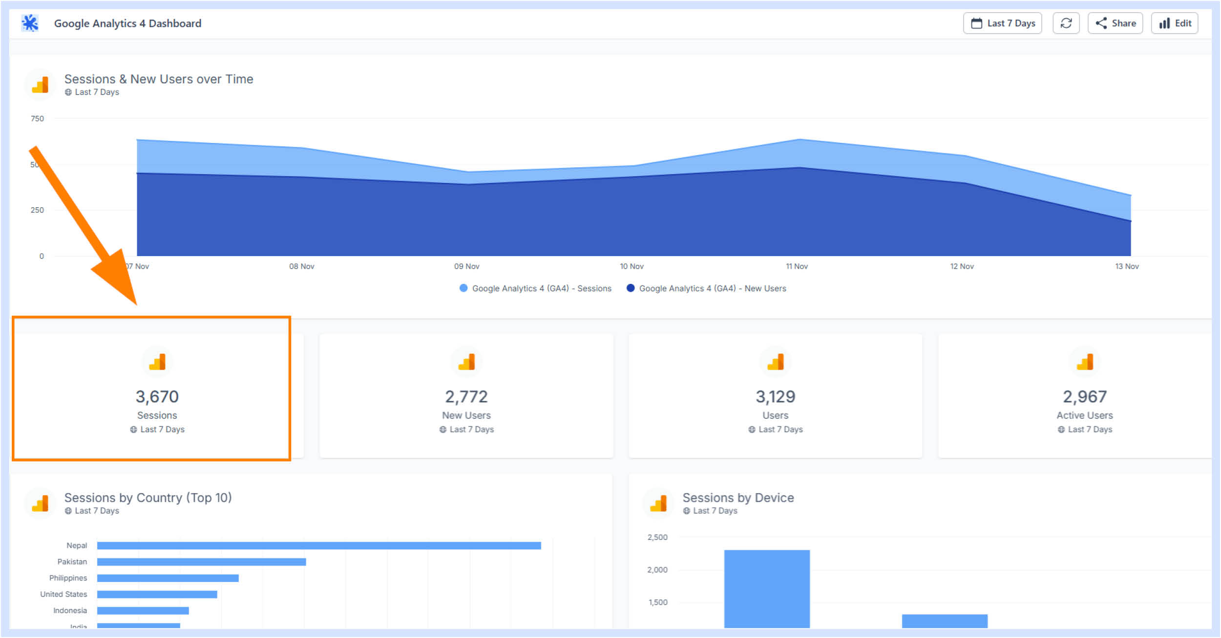
This is one of the simplest and most versatile ways to display your data as this data visualization type can be used to display KPIs for any industry and to represent data from any digital marketing platform.
Choosing the right visual display for metrics is key in data visualization for digital marketing. Scorecards concisely capture KPIs while line and bar charts showcase performance over time. They are perfect for displaying KPI totals that provide overviews of campaigns and for platform-wide data.
Scorecards are most commonly used as the first part of a report in order to introduce your client to your overall performance for the reporting period, before you dive into more granular data with a greater variety of chart types in the rest of the report.
Take a look at our Key Components of a Digital Marketing Report blog to find out more about how to structure your reports.
2. Line, Column and Area Charts
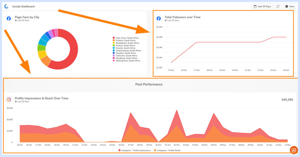
After Scorecard charts, Line, Column and Area Charts are the go-to for most marketers who are wishing to display time series data over a particular date range. These chart types are versatile in that they can display time-series data in many different groupings such as daily, weekly, monthly, or even yearly.
Another big positive of Line, Column and Area Charts is that they are incredibly easy to display both comparison data (previous period) via a separate line in combination with the lines for the actual performance over the period and even add a trend line in order to display an easy-to-read average on these chart types.
On Oviond this works great for displaying data such as Facebook Post Likes over time as this will help you see when in the month, or when in the week you are most likely to gain Likes on your posts, therefore making it easier to decide when the best time to post is.
3. Bar Charts
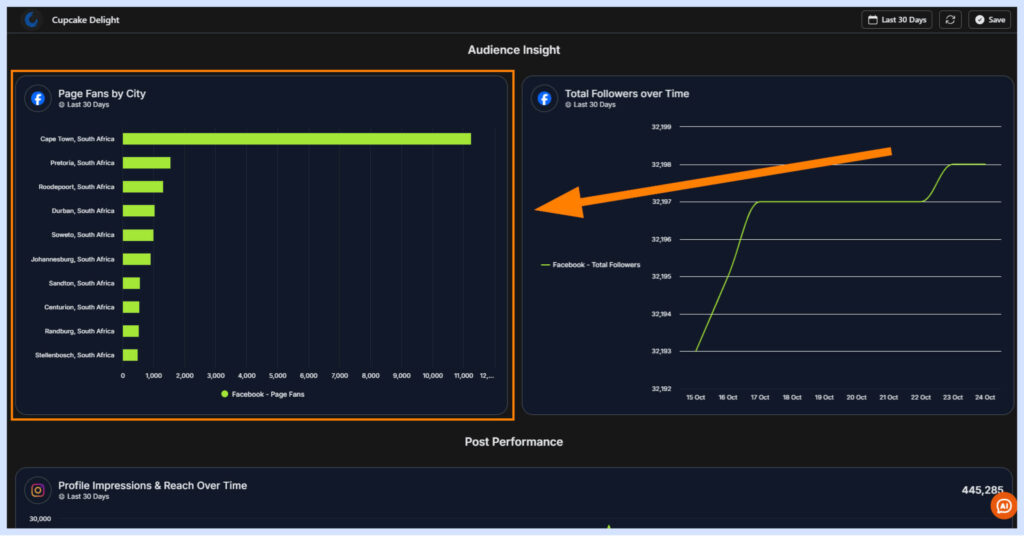
While Bar Charts may look similar to Column Charts, their purpose is actually entirely different. Column Charts are perfectly suited for time series data, while Bar Charts are better suited for displaying how a total is distributed between multiple groups in a category.
To give you an example of this, if you would like to see the number of sessions from users on your website across multiple devices, you would be able to use a Bar Chart to show how many sessions you’ve received on each different device type, where each device type would have its own bar in the graph.
4. Pie and Donut Chart
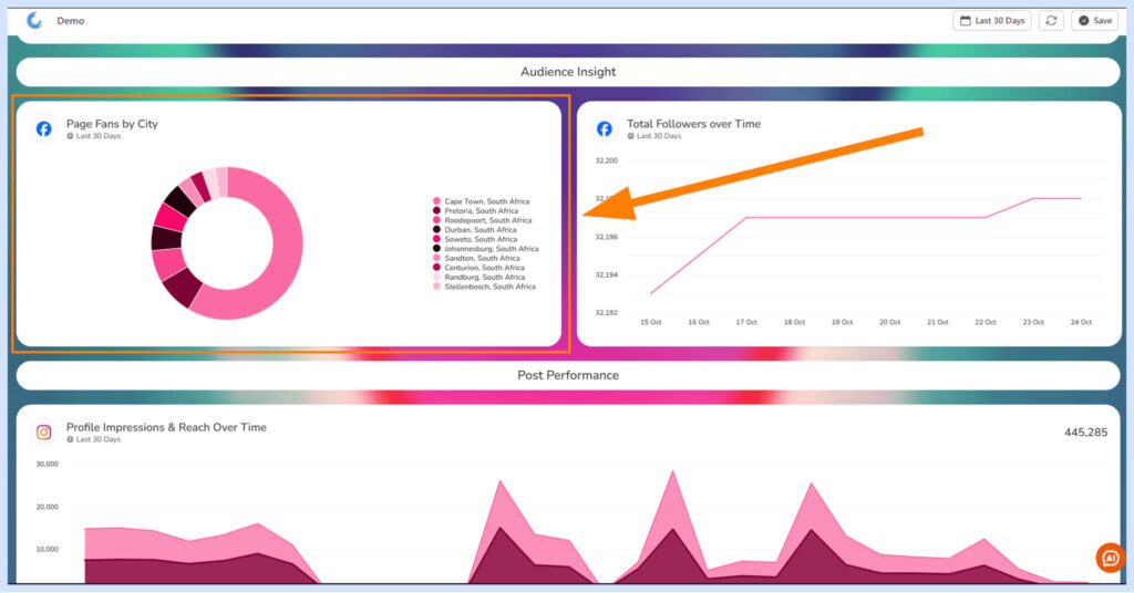
Similar to the Bar Chart, Pie and Donut Charts are great for displaying how a total is distributed between various groups in a category. Where Pie and Donut Charts really shine though is displaying this distribution as a percentage so that you can see how much of the total each group commands.
A great example of this would be to elaborate on metrics for demographic data such as displaying the age distribution of Page Likes on a Facebook Page.
5. Tables
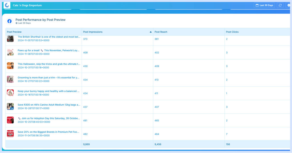
No surprises here, the Table Chart is still an incredible tool for showing a large amount of data in an ordered and easy-to-read way. You may be too traumatized from horrific Excel spreadsheets to even consider this chart type, but where it really starts to show its magic on Oviond is in displaying multiple metrics for specific social media posts, including the post creative, on platforms such as Facebook Ads.
This is a great way to give your client a visual and engaging representation of how your digital marketing efforts are performing.
The Advantages of Data Visualization
Implementing data visualization provides a range of specific benefits when it comes to managing and optimizing modern marketing efforts, which include:
Insightful Decision-Making
Data visualization in digital marketing enables both high-level and detailed performance analysis, spotlighting trends and variations with clarity. By using marketing data visualization tools, marketers can make faster, more informed decisions, linking strategy adjustments directly to visualized data points.
Improved Audience Engagement
Data visualization in digital marketing, paired with impactful data storytelling, captivates audiences by simplifying complex datasets. Compelling graphics make essential information more accessible, memorable, and shareable. Audiences engage best with content that is data-driven yet presented visually through effective marketing data visualization tools.
Enhanced Presentation Medium
Vibrant charts, graphs, and diagrams centered on key metrics enable clear communication, making it easier to present persuasive, data-backed cases. Through effective marketing data visualization, raw datasets are transformed into compelling presentations suited for client reports, internal briefings, and external content, driving home critical insights.
Flexibility & Versatility
Data visualization in digital marketing synthesizes information in a way that adapts seamlessly across various reporting formats. Whether creating monthly reports, quarterly presentations, or single graphics for social media, the versatility of marketing data visualization tools supports consistent and effective communication across platforms, making it easy to repurpose insights across mediums.
Faster Analysis for Better Decisions
By transforming complex marketing data into clear visualizations, marketing data visualization tools help professionals quickly identify the most relevant insights. This efficient approach saves time, enabling deeper analysis and paving the way for optimized strategies in digital marketing.

Data Visualization Best Practices in Digital Marketing
Effective data visualization in digital marketing is crucial for transforming raw metrics into actionable insights. Here are some updated best practices to enhance your marketing data visualization:
📖Highlight the Story in Your Data
Data visualization in digital marketing isn’t just about charts; it’s about telling a story that turns raw data into actionable insights. Effective data storytelling combines visuals and narrative, making complex information accessible and engaging, which supports strategic decision-making.
Why Data Storytelling Matters:
- Enhanced Understanding: Simplifies complex data for easy comprehension.
- Improved Engagement: Connects emotionally, making insights memorable.
- Actionable Insights: Adds context, bridging data to decisions.
Crafting Compelling Data Stories
To build effective data stories:
- Focus on key insights to avoid data overload.
- Start with a question and use marketing data visualization tools to find answers.
- Tailor the story to the audience’s needs.
- Structure with context, key players, and actionable insights.
- Use visuals to reinforce the narrative.
Impact: Data storytelling in digital marketing makes information accessible and impactful, ensuring that insights don’t just inform but inspire action.
📊Choose the Right Chart Types
Selecting the appropriate chart type is essential for accurate marketing data visualization. Use line graphs for tracking time series data, bar charts for comparing categories, pie charts for proportional breakdowns, and scatter plots for identifying correlations. By aligning metrics with suitable visual layouts, data visualization in digital marketing becomes more effective and insightful.
🎨Pick Beneficial Color Palettes
Strategic color choices in marketing data visualization enhance the clarity of key data points. Use consistent color coding to represent fixed metrics and choose palettes that are visually appealing while aligning with branding guidelines. Effective color use strengthens data visualization in digital marketing, making insights easier to interpret.
🔠Incorporate Readable Fonts
Typography plays a crucial role in the clarity of marketing data visualization. Use clean, easy-to-read font families at adequate sizes to ensure readability at a glance. Effective font choices help simplify information absorption, enhancing the impact of data visualization in digital marketing.
🔍Focus Visuals with Data Filtering
Filter out unnecessary datasets to keep your marketing data visualization focused on key metrics. By removing irrelevant data, visuals become clearer and more effective, allowing target metrics to stand out. Judicious data filtering enhances the clarity and impact of data visualization in digital marketing.
📱Design for Different Devices and Screen Sizes
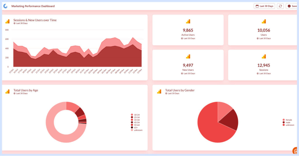
As mobile usage grows, creating responsive marketing data visualizations is essential. Apply responsive design principles, test on various devices, and simplify complex charts for smaller screens. Prioritize vertical scrolling for mobile to ensure effective data visualization in digital marketing across all screen sizes.
✔️Ensure Data Accuracy and Integrity
Credibility in data visualization in digital marketing hinges on data accuracy. Regularly audit data sources, apply validation techniques, and communicate any limitations in your visualizations. Transparent data collection and processing practices maintain integrity and trust in your marketing data visualization efforts.
🔄Regularly Update and Maintain Visualizations
As marketing data visualization tools evolve, keeping your visualizations up to date is essential. Set up automated data refreshes, review visualizations regularly to reflect current trends, and archive outdated visuals to maintain a clean, relevant dashboard. Ensure all data sources remain connected and functional for accurate data visualization in digital marketing.
📈Incorporate User Feedback to Improve Visualizations Over Time
User feedback is vital for refining marketing data visualization. In fact, a study by UserTesting found that 85% of issues can be identified with just 5 users. To enhance your visualizations, regularly solicit feedback from stakeholders and end-users, track the most frequently used visualizations, and conduct usability tests to uncover improvement areas. Iterating on designs based on user insights ensures that data visualization in digital marketing remains accurate, relevant, and responsive to changing needs.
By adhering to these best practices, you can create data visualizations that not only effectively communicate your digital marketing insights but also remain relevant, accurate, and user-friendly over time. Remember, the goal of data visualization in digital marketing is to transform raw data into clear, actionable insights that drive better decision-making and strategy.

Accessibility in Data Visualization
As digital marketers, we often rely on data visualization to communicate complex information quickly and effectively. However, it’s crucial to ensure that our visualizations are accessible to all users, including those with visual impairments or color blindness. Creating accessible data visualizations not only broadens your audience but also improves the overall user experience for everyone.
Why Accessibility Matters in Data Visualization
- Inclusive Communication: Accessible visualizations ensure that all users, regardless of their abilities, can understand and interpret your marketing data.
- Legal Compliance: Many countries have laws requiring digital content to be accessible, including data visualizations used in public-facing marketing materials.
- Improved User Experience: Techniques that make visualizations accessible often enhance clarity and usability for all users, not just those with disabilities.
- Broader Reach: By making your data visualizations accessible, you can potentially reach a larger audience, including the estimated 300 million color-blind people worldwide.
Key Strategies for Creating Accessible Data Visualizations
| Accessibility Guideline | Description |
|---|---|
| Use Color-Blind Friendly Palettes | Avoid problematic color combinations like red/green or blue/yellow. Opt for high-contrast color schemes. Utilize patterns or textures to differentiate data points. |
| Provide Alternative Text | Include descriptive alt text for images of charts and graphs. Offer a text-based summary of key insights from the visualization. |
| Ensure Keyboard Navigation | Make interactive visualizations navigable via keyboard for users who can’t use a mouse. |
| Use Direct Labeling | Label data points directly on the visualization rather than relying on a separate legend. This reduces cognitive load and aids accessibility for colorblind and low vision users. |
| Offer Multiple Formats | Provide data in alternative formats, such as a table or downloadable spreadsheet. Consider using sonification (data represented with sound) for certain types of data. |
| Keep It Simple | Use familiar chart types when possible. Avoid overly complex visualizations that may be difficult to interpret. |
By implementing these strategies, you can create data visualizations that are not only visually appealing but also inclusive and accessible to a wider audience. This approach aligns with best practices in digital marketing, ensuring that your insights reach and resonate with as many people as possible.
Remember, accessibility in data visualization is an ongoing process. Stay informed about the latest accessibility guidelines and technologies and regularly seek feedback from users with diverse needs to continually improve your visualizations.
Emerging Trends in Data Visualization for Digital Marketing
As the field of digital marketing continues to evolve, so do the tools and techniques for data visualization. Staying ahead of these trends is crucial for marketers looking to leverage the full potential of their data. Here are some key emerging trends in marketing data visualization:
Interactive and Real-Time Dashboards
The days of static reports are fading. Modern marketing data visualization tools now offer interactive and real-time dashboards that allow marketers to explore data dynamically and make decisions based on up-to-the-minute information
These dashboards enable marketers to:
- Filter and segment data on the fly
- Drill down into specific metrics for deeper insights
- Monitor campaign performance in real-time
- Adjust strategies quickly based on live data
AI-Powered Visualizations
Artificial intelligence is revolutionizing data visualization in digital marketing. AI-powered tools can automatically generate insights and suggest the most appropriate visualizations for given datasets.
This trend is particularly beneficial for:
- Identifying complex patterns and correlations in large datasets
- Automating the creation of visually appealing and informative charts
- Providing predictive analytics for future marketing performance
- Offering natural language querying for easier data exploration
“As the field of data visualization in digital marketing evolves, it’s crucial to stay updated…”
Augmented and Virtual Reality (AR/VR) in Data Visualization
As we move towards more immersive digital experiences, AR and VR technologies are creating new possibilities for data visualization in digital marketing.
These technologies allow marketers to:
- Interact with data in three-dimensional space
- Create immersive data storytelling experiences
- Visualize complex relationships between different marketing metrics
- Collaborate with team members in virtual data environments
By incorporating these emerging trends into your data visualization strategy, you can enhance your ability to extract meaningful insights from your marketing data and communicate those insights more effectively to stakeholders.
Data Visualization Tools for Digital Marketing
As the field of data visualization in digital marketing evolves, it’s crucial to stay updated on the most powerful and user-friendly tools available. Here’s an overview of some leading options that offer robust capabilities for creating impactful visualizations:
Tableau
Tableau remains a powerhouse in the data visualization landscape, offering a wide range of features that cater to both beginners and advanced users:
- Interactive Dashboards: Create dynamic, interactive visualizations that allow users to explore marketing data in real-time.
- Diverse Chart Types: Access a vast library of chart types and customization options to best represent your digital marketing metrics.
- Data Connectivity: Connect to various marketing platforms, databases, and cloud services for comprehensive data integration.
- Mobile Optimization: Design visualizations that are responsive and accessible on mobile devices, perfect for on-the-go marketing teams.
Tableau’s strength lies in its ability to handle large datasets and create complex visualizations with relative ease, making it ideal for in-depth marketing analytics.
Power BI
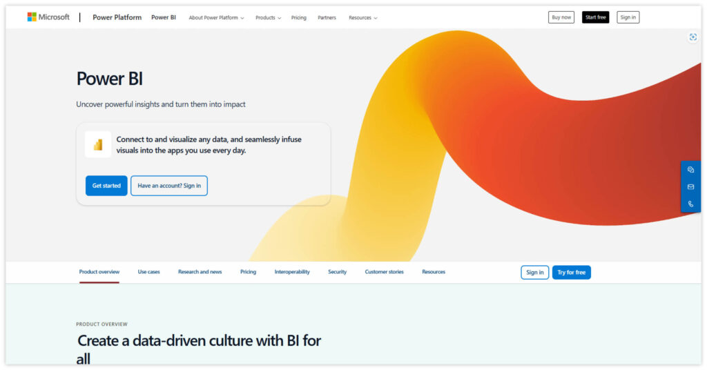
Microsoft’s Power BI has gained significant traction in recent years, offering a comprehensive suite of business analytics tools:
- Integration with Microsoft Ecosystem: Seamlessly integrates with other Microsoft products, making it a natural choice for organizations already using Office 365 or Azure.
- AI-Powered Insights: Leverages artificial intelligence to uncover hidden patterns and provide automated insights from your marketing data.
- Custom Visualizations: Offers a marketplace for custom visuals, allowing marketers to create unique and branded data presentations.
- Real-Time Analytics: Supports real-time data processing, enabling up-to-the-minute marketing performance tracking.
Power BI’s user-friendly interface and strong data modeling capabilities make it an excellent choice for marketers looking to create both simple and complex visualizations.
Looker
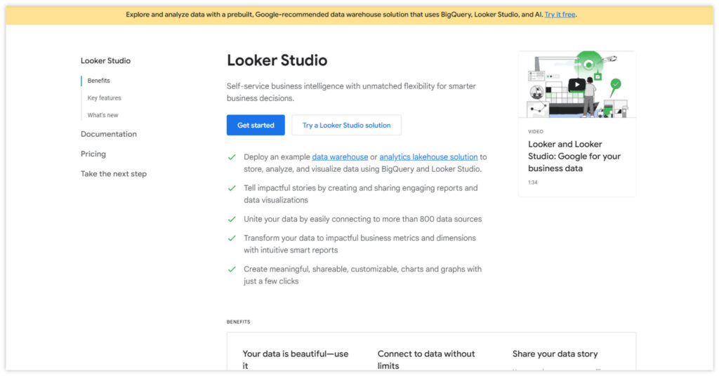
Now part of Google Cloud, Looker has emerged as a powerful contender in the business intelligence and data visualization space:
- LookML: Utilizes a unique modeling language that allows for the creation of reusable, maintainable data models.
- Embedded Analytics: Easily embed visualizations and dashboards into other applications or websites, enhancing the reach of your marketing insights.
- Collaborative Features: Offers robust sharing and collaboration tools, facilitating team-wide access to marketing data visualizations.
- Cross-Database Joins: Enables joining data from multiple sources, providing a comprehensive view of marketing performance across channels.
Agency Analytics
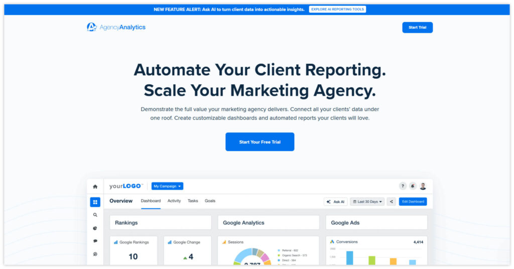
Agency Analytics is tailored specifically for digital marketing agencies and professionals:
- Custom Reporting Suite: Offers white-labeling options and a wide range of customizable reports for client management.
- Extensive Integrations: Provides connections to over 70 marketing platforms, allowing comprehensive data aggregation.
- Automated Scheduling: Features automated report generation and distribution, streamlining the reporting process.
- Client Management: Includes client login capabilities and permission settings for collaborative work environments.
DashThis
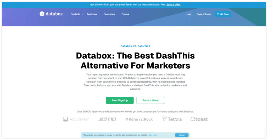
DashThis is designed for freelancers and small to medium-sized marketing teams:
- Drag-and-Drop Interface: Enables quick and easy creation of interactive dashboards without technical expertise.
- Pre-built Templates: Offers a variety of templates for different marketing channels, speeding up the reporting process.
- Automated Reporting: Allows for automated report creation and distribution, saving time for small teams.
- White-Labeling: Provides options for customizing reports with agency or client branding.
Oviond
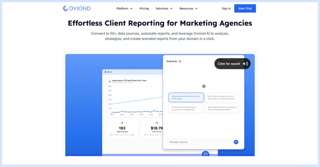
Oviond caters to both marketing agencies and in-house marketing departments, offering the following features:
- Multi-Channel Integration: Consolidates data from various marketing channels for a comprehensive view of performance.
- Customizable Templates: Offers a range of customizable reporting templates to suit different client needs.
- Scalable Solutions: Provides features that support agency growth and expanding client bases.
- Automated Updates: Features automatic data refreshes and report updates, ensuring up-to-date insights.
- AI-Powered Insights: Utilizes advanced AI capabilities to analyze data, generate strategic recommendations, and automate report writing, enhancing efficiency and decision-making.
By leveraging these advanced data visualization tools, digital marketers can transform raw data into compelling visual stories, enabling faster insights and more informed decision-making. Each tool offers unique strengths, from Tableau’s powerful data handling to Power BI’s Microsoft ecosystem integration, and from Looker’s collaborative features to Agency Analytics’ marketing-specific focus. Whether you prioritize ease of use, integration with existing systems, or advanced modeling capabilities, these tools offer solutions to meet a wide range of marketing data visualization needs.
When selecting the right tool to enhance your digital marketing reporting and analysis capabilities, consider your specific requirements, budget, team expertise, and scalability needs. Remember that the best tool is one that not only meets your current needs but can also grow with your organization’s evolving data visualization demands.
As we harness the power of these tools to create impactful visualizations, it’s crucial to consider the ethical implications of our data practices. Let’s explore the important topic of data ethics and privacy in marketing visualization.

Data Ethics and Privacy in Marketing Visualization
As marketers increasingly rely on data visualization to communicate insights and drive decisions, it’s crucial to consider the ethical implications of how we collect, represent, and present data. Ethical data visualization in marketing goes beyond just creating visually appealing charts; it involves ensuring transparency, protecting privacy, and avoiding misleading representations.
Data Privacy Considerations
When visualizing marketing data, it’s essential to prioritize consumer privacy:
- Anonymization: Ensure that any personally identifiable information (PII) is removed or anonymized before visualization. This protects individual privacy while still allowing for meaningful insights.
- Aggregation: When dealing with sensitive data, consider aggregating it to a level that prevents individual identification while still providing valuable insights.
- Consent: Only visualize data that has been collected with proper consent from consumers. Be transparent about how the data will be used and visualized.
Transparency in Data Collection and Representation
In your data visualizations, it’s essential to clearly indicate data sources to help viewers assess the credibility and context of the information presented. Additionally, transparency about the methodology, including data collection, cleaning, transformations, or statistical techniques, allows audiences to understand how the data was processed. Finally, acknowledging any limitations or potential biases in the data or visualization methods builds trust, providing a more complete and honest perspective for your audience.
Avoiding Misleading Visualizations
Creating accurate and honest visualizations is crucial for ethical marketing:
| Guideline | Description |
|---|---|
| Appropriate Scales | Use appropriate scales on axes to avoid exaggerating or minimizing differences. Starting y-axes at zero for bar charts prevents visual distortion. |
| Context | Provide necessary context for your visualizations, such as historical data, industry benchmarks, or other relevant comparisons. |
| Color Choices | Use colors thoughtfully to avoid unintentional bias or misleading emphasis. Be aware of cultural differences in color interpretation. |
| Completeness | Avoid cherry-picking data points that support a particular narrative. Present a complete picture, even if it doesn’t align with marketing goals. |
Ethical Considerations in Practice
To ensure ethical data visualization in marketing:
- Regularly audit your data collection and visualization practices for potential ethical issues.
- Involve diverse perspectives in the creation and review of visualizations to identify potential biases or misrepresentations.
- Prioritize clarity and accuracy over visual appeal or marketing objectives.
- Provide options for viewers to access the raw data or more detailed explanations behind visualizations.
- Consider the potential impact of your visualizations on different stakeholder groups, including vulnerable populations.
By adhering to these ethical principles, marketers can create data visualizations that not only effectively communicate insights but also build trust with their audience and contribute to responsible data practices in the industry. Remember, ethical data visualization is not just about avoiding deception; it’s about actively striving for clarity, honesty, and respect for your audience’s intelligence and privacy.

Visualize Success!
The data age demands modern marketing teams visualize insights faster. Raw datasets alone overwhelm but strategic visual representations enlighten, spotlighting meaningful patterns across campaigns. Scorecards concisely communicate totals. Line graphs elucidate trends over intervals. Bar charts compare categories clearly. Pie charts convey proportional breakdowns. Dashboards efficiently synthesize cross-channel efforts.
Data visualizations thus provide clarity amid endless metrics, enabling streamlined reporting. They tell stories through aesthetically expressive graphics grounded in numbers. Audiences better understand performance via visuals. Agencies better optimize client spend guided by visualized data signals. Simply put, sharp visualization precipitates sharper marketing.
So continually hone data visualization acumen alongside analysis skills. Together they transform disjointed numbers into launching pads for the next data-driven decisions that tangibly improve results. Let artful charts both capture attention now through engaging design and crystallize lasting takeaways through insightful revelation of underlying patterns across the metrics that matter most.
If you would like to see how all of these chart types look like on Oviond, sign up for our 15-day free trial and try for yourself.
Frequently Asked Questions about Data Visualization in Digital Marketing
What type of data visualizations work best for social media analytics?
Line graphs and bar charts are most effective for tracking performance over time and comparing metrics across social platforms. Heatmaps also provide useful insight into optimal posting times.
How can I integrate data from multiple sources into a single visualization?
Integrating data from multiple sources can be challenging due to data silos in marketing, but it’s crucial for comprehensive insights:
-Use data integration tools or platforms that support multiple data sources
-Ensure data consistency across sources (e.g., date formats, metrics definitions)
-Create a data warehouse or lake to centralize data from various sources
-Use APIs to connect different marketing tools and platforms
-Implement data cleansing and normalization processes
-Consider using visualization tools that offer built-in data connectors for popular marketing platforms
How do I turn my raw marketing data into meaningful insights?
Use data visualization software to transform volumes of metrics into dynamic charts, graphs, and dashboards spotlighting key trends, opportunities, and takeaways.
What free data visualization tools are available?
Top free options include Google Data Studio, Canva, RawGraphs, and Datawrapper. These enable creating charts and basic reporting.
Can I build a data viz dashboard if I’m not technical?
Yes, many intuitive drag-and-drop platforms require no coding to connect data sources and design visualizations. Focus is on functionality over complex customization.
What role does data visualization play in personalization and customer journey mapping?
Data visualization is crucial in personalization and customer journey mapping:
-Create visual customer journey maps highlighting touchpoints and interactions
-Use sankey diagrams to visualize customer flow through different marketing channels
-Visualize segmentation data to identify personalization opportunities
-Create heatmaps of customer behavior on websites or apps
-Use interactive dashboards to explore customer data across different segments and journeys
-Visualize A/B testing results for personalization efforts
Create visual representations of customer personas based on data insights
Why should my agency invest more in data visualization?
Impactful data visualizations better communicate marketing analytics to internal teams and external clients, leading to faster insights and better decisions.
How do data visualizations actually influence marketing decisions?
Easy-to-interpret performance charts help pinpoint high-converting segments to target more or low-performing areas to optimize.
What’s a simple data visualization I can start creating today?
Build a line graph in Google Data Studio tracking website sessions over the past month to determine whether traffic is trending up or down.
What visualization should I use to compare metrics across social platforms?
A bar graph with labeled bars for each network (Facebook, Instagram, etc.) stacked with performance data is perfect for benchmarking channel metrics.
Should I include interactive elements in client-facing dashboards?
Yes, filters and toggles that enable clients to dive deeper into dashboard visuals provide self-serve customization for further personalization.
How much context should accompany data visualizations?
Summarize key takeaways from graphics through concise annotations so audiences know exactly what marketing decisions the data is driving.
Can I use data visualization to spot correlations between website elements?
Yes, scatter plots with conversion data plotted against various page style, content, or placement attributes uncover which design and content factors may impact conversions.
What’s the most important rule for formatting data visualizations?
Stick to simple designs, universal layouts and minimal chart types selected specifically to clearly communicate focal performance data related to goals. Avoid superfluous visual flair that distracts from core analytics.
What are the best practices for creating data visualizations for mobile devices?
As more marketing reports are being viewed on smartphones and tablets, it’s crucial to optimize your data visualizations for mobile:
-Use responsive design to ensure visualizations adapt to different screen sizes
-Simplify complex charts and graphs for smaller screens
-Prioritize vertical scrolling over horizontal for easier mobile navigation
-Use touch-friendly interactive elements for mobile users
-Ensure text is legible on smaller screens without zooming
-Test visualizations across various devices and screen sizes
Should I invest more in data analysis or data visualization skills on my team?
Aim for parallel investments so analysts extract insights from data while design-minded team members translate analytics into impactful graphics.
How do I make a business case for purchasing data visualization software?
Beyond easier reporting, the tool can facilitate faster optimization decisions across channels, boosting ROAS potential to justify costs.
What should I look for in a data visualization solution?
Seek out ease of use, ready-made templates, customizable reporting, clear pricing, data connectivity capabilities, and responsive support.
