
Oviond Blog
Web Analytics Dashboards That Scale for Marketing Agencies
Build effective web analytics dashboards that impress clients and scale with your agency. A step-by-step guide on design, automation, and white-label delivery.
If you run client reporting for more than a handful of accounts, you already know the pattern. One account manager is pulling GA4. Another is exporting ad data into a spreadsheet. Someone else is fixing broken formulas in last month's template because a client added LinkedIn Ads, changed goals, or wanted their logo swapped before the call.
That mess doesn't stay small. It grows with every new retainer, every extra channel, and every “can you just add this metric?” request. At some point, reporting stops being a deliverable and starts becoming an ops problem.
That's why web analytics dashboards matter for agencies. Not because dashboards look cleaner than spreadsheets, but because they give you a reporting system you can repeat across 5–50+ clients without losing control of data, delivery, or branding. If you want agency reporting that finally feels simple, you need more than charts. You need a workflow your team can run every month without chaos.
Table of Contents
- The End of Manual Client Reporting Hell
- Laying the Foundation for Scalable Reporting
- Connecting Your Data Sources Without the Chaos
- Designing Dashboards That Clients Actually Use
- Automating White-Label Delivery and Reporting
- Dashboard Governance That Prevents Report Rot
- Frequently Asked Questions for Agencies
The End of Manual Client Reporting Hell
The usual reporting breakdown happens on a Sunday or late Monday morning. A client review is coming up. One dashboard is missing Meta data. Search Console numbers don't match the spreadsheet. The PDF still has last month's branding. The account manager is wasting time on formatting instead of deciding what to say in the meeting.
That isn't a small inefficiency. Agency analysts spend 10–15 hours per week on manual reporting tasks, and that burden gets worse as client rosters and channel mix grow, which is exactly why automation matters for agencies managing 5–50+ clients according to Improvado's agency reporting analysis.
Practical rule: If your senior team is still copying numbers into slides, your reporting process is broken.
A lot of agencies try to solve this with a prettier template. That doesn't fix the root problem. The underlying problem is that the reporting process has no system behind it. Data lives in separate tools, delivery depends on whoever remembers to send it, and every client version becomes a one-off.
You need a setup that pulls source data into one place, keeps it current, applies client branding consistently, and lets your team turn real-time insights into actions instead of babysitting exports. That's the shift from “we make reports” to “we run reporting operations.”
If you're still debating whether manual reporting is sustainable, compare the two models side by side in this breakdown of manual reporting vs automated digital marketing reporting. The difference isn't cosmetic. It changes how your agency scales.
Laying the Foundation for Scalable Reporting
Most bad dashboards fail before anyone adds a chart. They fail in the kickoff call, when the agency agrees to “report on everything” instead of deciding what the client needs to track.
A usable web analytics dashboard starts with a hard conversation about outcomes. Not channel vanity. Not a shopping list of every available metric. Outcomes.
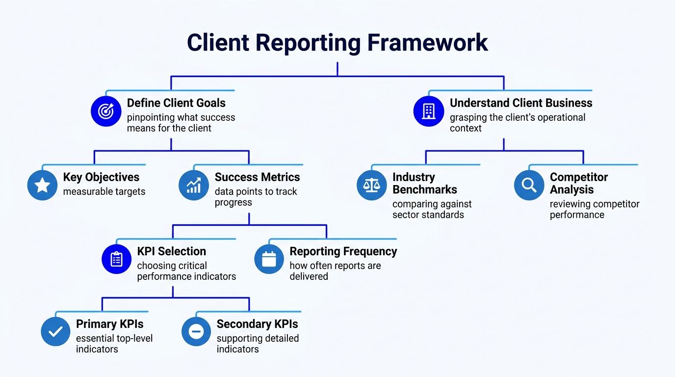
Start with the business goal, not the channel
Run a KPI discovery session before you build anything. Keep it simple and direct.
Ask questions like:
- What does success look like this quarter. More leads, lower CPA, stronger pipeline quality, better retention support, or clearer attribution.
- Who reads the report. The owner, marketing contact, ops lead, or board-facing stakeholder.
- What decision should the dashboard support. Budget shifts, campaign changes, landing page fixes, or channel prioritization.
- What absolutely doesn't belong. Old KPIs, edge-case charts, and “nice to have” widgets that no one will act on.
The discipline here matters. Expert dashboard methodology says teams should prioritize 5–15 maximum KPIs to avoid cognitive overload, which can reduce decision-making speed by 40% in agency settings according to TechnologyAdvice's dashboard methodology guide.
That's the line I use with clients. If everything is important, nothing is clear.
Build two views, not one overloaded dashboard
Most agencies cram executive summary, channel detail, commentary, and technical diagnostics into one dashboard. Clients stop using it because it tries to serve everyone at once.
Split it instead.
| Audience | What they need | What to show |
|---|---|---|
| Leadership contact | Fast status check | Goal progress, spend, leads, conversions, core trend lines |
| Day-to-day marketing contact | Working detail | Campaign breakdowns, source performance, landing page data, notes |
This is also where goal tracking earns its place. If the dashboard can show progress against agreed targets, the report stops being a bundle of disconnected metrics and starts showing whether the agency is moving the account in the right direction.
A strong dashboard doesn't prove you collected data. It proves you understand what the client hired you to improve.
Keep naming conventions tight. Keep KPI definitions consistent across clients. Decide reporting frequency upfront. Then template the structure so your team isn't rebuilding logic account by account.
Connecting Your Data Sources Without the Chaos
The fastest way to wreck reporting quality is to let every account manager build their own data workflow. One person uses CSV exports. Another uses Looker Studio with connector workarounds. Someone else pastes screenshots into slides because the platform connection broke an hour before the meeting.
That's not flexibility. That's operational debt.
The spreadsheet method breaks as soon as you scale
Manual export-and-paste reporting looks cheap until you count the cost of dirty data and rework. According to a Forrester study, marketers waste 21 cents for every media dollar spent, equal to 32% of billable time, managing data quality problems instead of strategy, as summarized in Coupler's reporting review.
That's why I push agencies toward connected dashboards with API-based sources. Not because it's more advanced, but because it's harder for your process to fail unnoticed.
A dependable reporting stack should pull from the platforms you already manage. GA4, Google Ads, Meta Ads, LinkedIn Ads, Microsoft Ads, Search Console, email, CRM, and ecommerce sources should feed one client view without a human stitching the file together every month. If you're reviewing platform coverage, this list of marketing reporting data sources is the right place to sanity-check what your agency needs.
What a connected reporting stack should do
Here's the standard I use when evaluating tools for multi-client reporting:
- Pull direct source data so account managers don't have to rebuild exports every cycle.
- Support blended metrics across platforms when the client cares about total CPA, total conversions, or full-funnel performance.
- Handle branded client delivery without extra design work.
- Let ops standardize templates while still giving account teams room to customize.
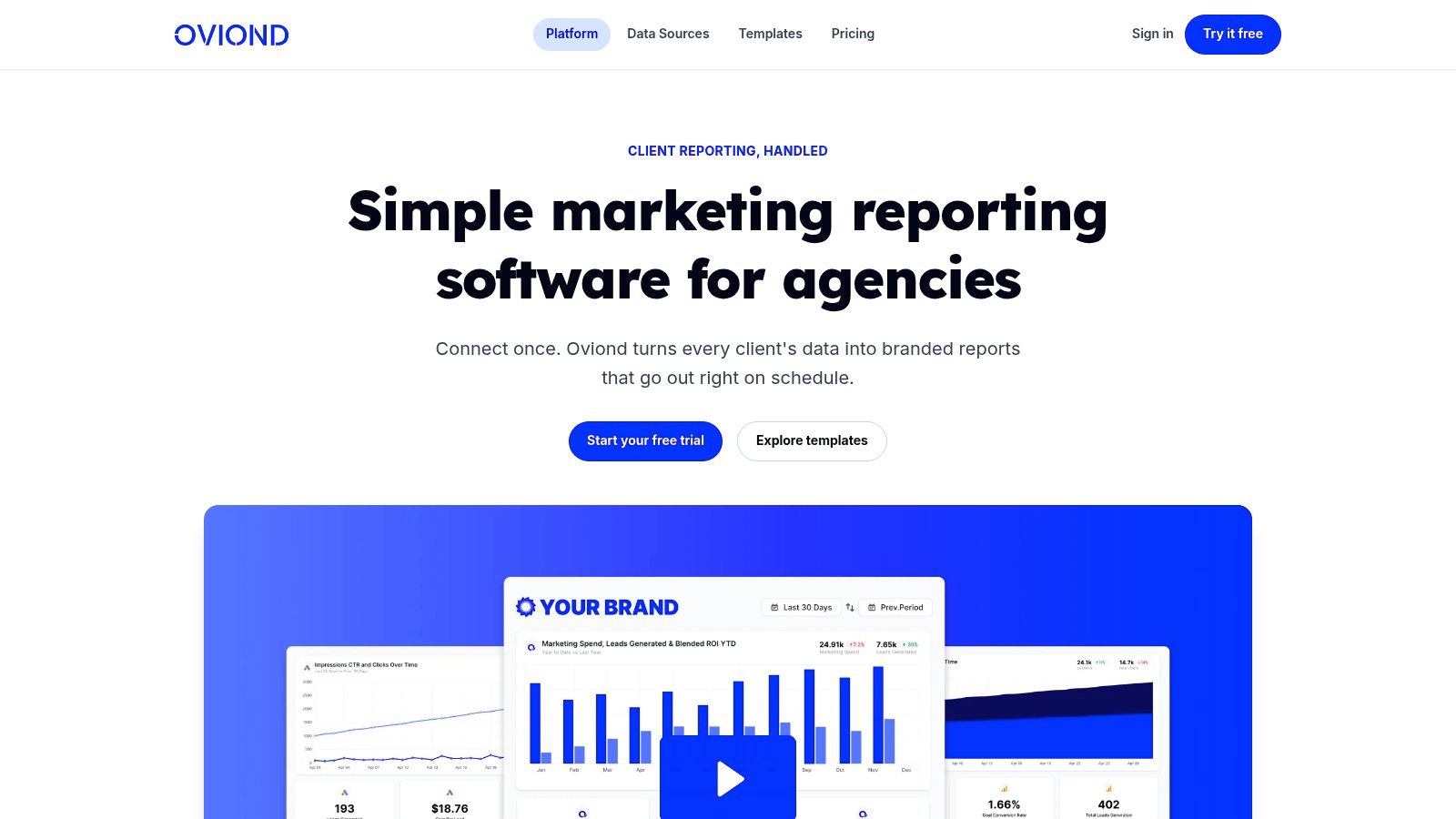
Agency-native tools hold an advantage. Oviond, for example, gives agencies white-label client reporting, branded dashboards, custom domain support, automated delivery, AI/MCP-assisted setup, and 50+ integrations in one plan structure built around client count rather than per-user limits. AgencyAnalytics, Whatagraph, and Swydo also sit in this same agency reporting category, while Looker Studio gives more raw flexibility but usually needs more setup discipline to stay manageable.
If you want to see what a cleaner connected workflow looks like in practice, this walkthrough is worth a few minutes:
Stop rewarding heroic spreadsheet work. Build a reporting process that works even when your busiest account manager is out for the week.
Designing Dashboards That Clients Actually Use
A dashboard can have accurate data and still fail. Clients ignore dashboards that are cluttered, generic, ugly, or hard to scan. They use dashboards that answer the obvious questions quickly and make the next action clear.
That means layout matters. Labeling matters. Branding matters. The order of information matters.
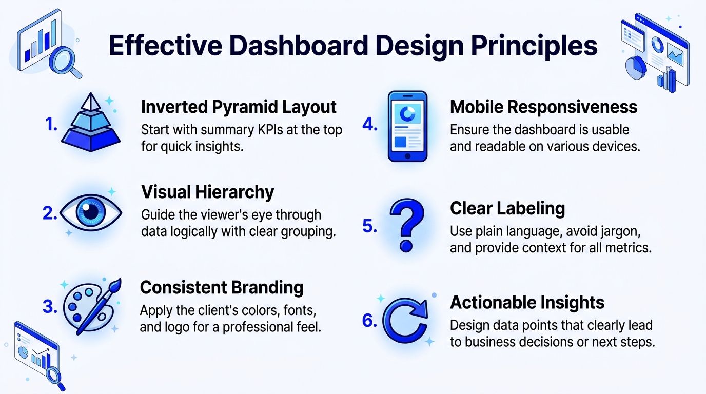
Use layout to control the conversation
Don't start with channel detail. Start with the business summary in the upper-left area, where the eye lands first. Then move into trends, then supporting breakdowns, then notes.
A simple structure works across most agency accounts:
- Top row. Core KPIs tied to the client goal.
- Second row. Trend charts that show direction over time.
- Third row. Channel or campaign breakdowns.
- Bottom section. Commentary, next steps, and exceptions.
This structure isn't about aesthetics. It keeps the dashboard from turning into a warehouse of widgets. The more direct the visual path, the easier the client meeting becomes.
For accessibility and readability, be careful with brand colors. Many agencies force a client palette into charts without checking whether labels and trend lines stay readable. If your team needs a practical refresher, WebAbility.io's color contrast guide is useful for making branded dashboards easier to read.
Standardize the structure, customize the story
Templates save agencies a lot of pain, but templated reporting goes bad when every dashboard looks copied and irrelevant. The fix is simple. Standardize the skeleton, then customize the metrics, notes, and views around the client's goals.
Use a repeatable approach:
- Keep reusable sections for PPC, SEO, paid social, website performance, and lead generation.
- Swap visuals based on the metric. Line charts for trends, bars for comparisons, tables when clients need exact values.
- Use plain labels so clients don't need your team to translate dashboard language.
- Add commentary blocks where account managers can explain what changed and what happens next.
According to BARC's BI adoption data, 60% of business users see customized dashboards created with self-service authoring tools as the clearest version of self-service analytics. That matters because most agencies don't need more reporting complexity. They need more people on the team to build and maintain dashboards without waiting on a specialist.
That's why drag-and-drop builders and AI-assisted setup are useful in agency reporting. They let account managers create clean, client-ready views faster, while ops still keeps standards in place. If your team needs a stronger handle on chart choice and layout decisions, this guide to data visualisations in reports and dashboards is worth bookmarking.
If a client can't understand the dashboard in under a minute, the design is doing too much and saying too little.
Automating White-Label Delivery and Reporting
A dashboard isn't finished when the charts are built. It's finished when the client receives it in a way that looks professional, on-brand, and consistent every single time.
That last mile is where a lot of agencies still look amateur. They send a link with the software vendor's branding. They attach a PDF with mixed fonts. They use one sender name for some clients and another for the rest. Then they wonder why reporting feels transactional instead of premium.
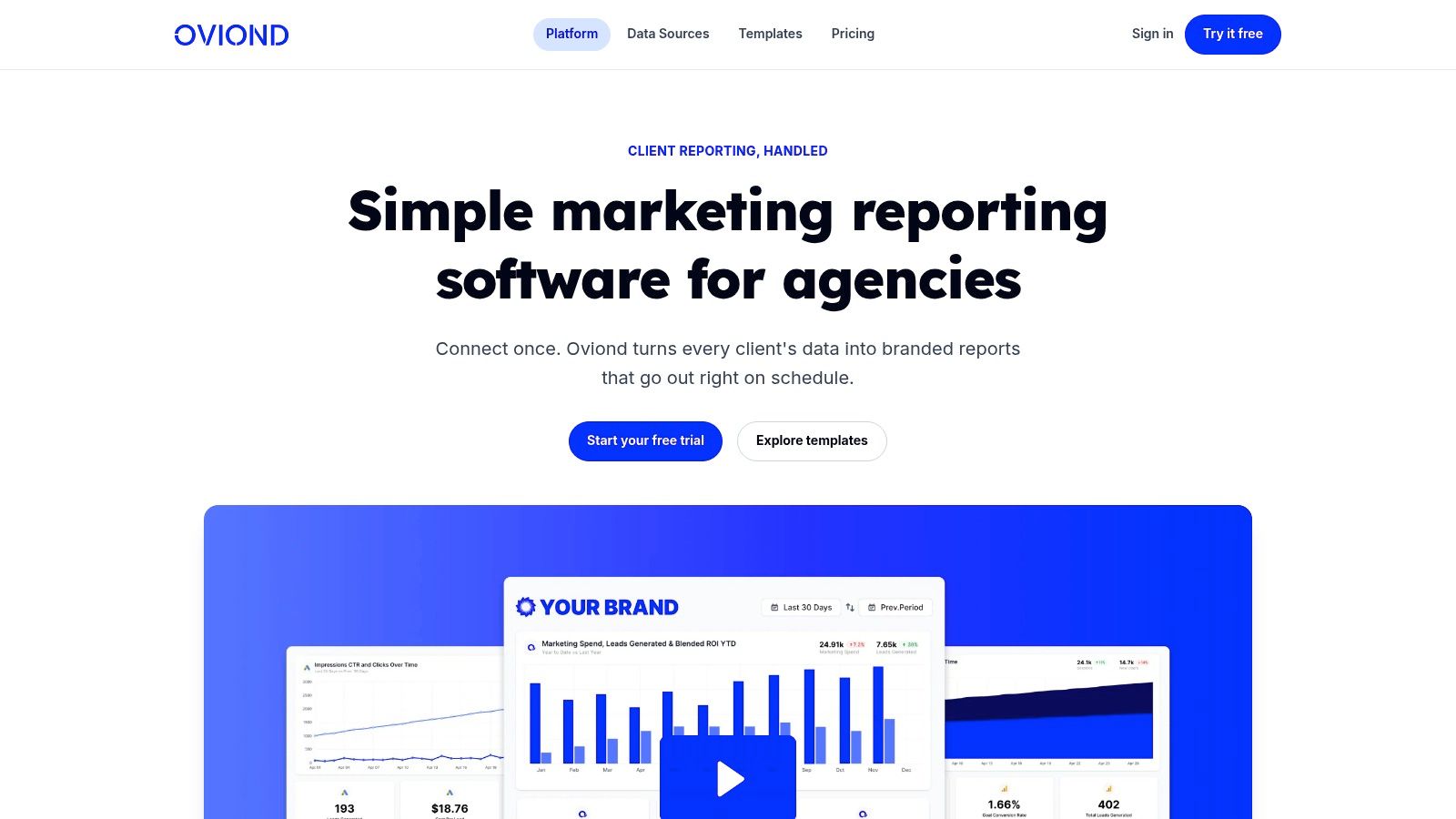
White-label is part of the service, not a nice extra
Clients hire your agency, not your reporting vendor. So the delivery should look like it came from your agency.
That means your process should include:
- Branded dashboards with client-facing colors, logo, and clean layout
- White-label delivery with vendor branding removed
- Custom domain options so links look like part of your agency experience
- Custom email sender settings so scheduled reports land with the right identity
- Automated delivery so no one on your team has to remember send dates
This matters even more because stale reports wreck trust. A common dashboard failure is lack of automated refreshes, which leads to 68% of reports being outdated by delivery according to Avinash Kaushik's dashboard benchmarking discussion.
If you're tightening up white-label delivery, this practical guide on how to white-label your digital marketing reports and dashboards covers the operational details agencies need to think through.
How the main options compare
Different tools handle delivery very differently. Here's the plain version.
| Tool | Fit for agencies | White-label and branding | Operational trade-off |
|---|---|---|---|
| Oviond | Built for multi-client reporting | Strong white-label options, custom domain, unlimited reports and dashboards, pricing by client count | Agency-focused setup, less general-purpose BI complexity |
| AgencyAnalytics | Built for agency reporting | Strong agency-facing delivery and templates | Teams should check pricing and workflow fit by client mix |
| Whatagraph | Strong for marketing reporting teams | Good branded delivery and visualization polish | Can suit agencies that want presentation-heavy reports |
| Swydo | Reporting-focused agency option | White-label support and recurring reporting workflows | Best fit depends on how deep your dashboards need to go |
| Looker Studio | Flexible and widely used | Possible, but often more fragmented and technical to polish for clients | More setup overhead, more room for inconsistency across accounts |
If your team wants a broader design refresher while tightening report presentation, this beginner-friendly guide to user interface design is a useful reminder that trust starts with what clients see first.
Dashboard Governance That Prevents Report Rot
Most agencies put all their effort into dashboard launch and almost none into dashboard maintenance. That's why reporting slowly turns into clutter. Old campaign widgets stay. Dead KPIs remain on page one. Nobody knows which dashboard version is current. Clients stop checking it because the signal is buried under leftovers.
That's report rot.
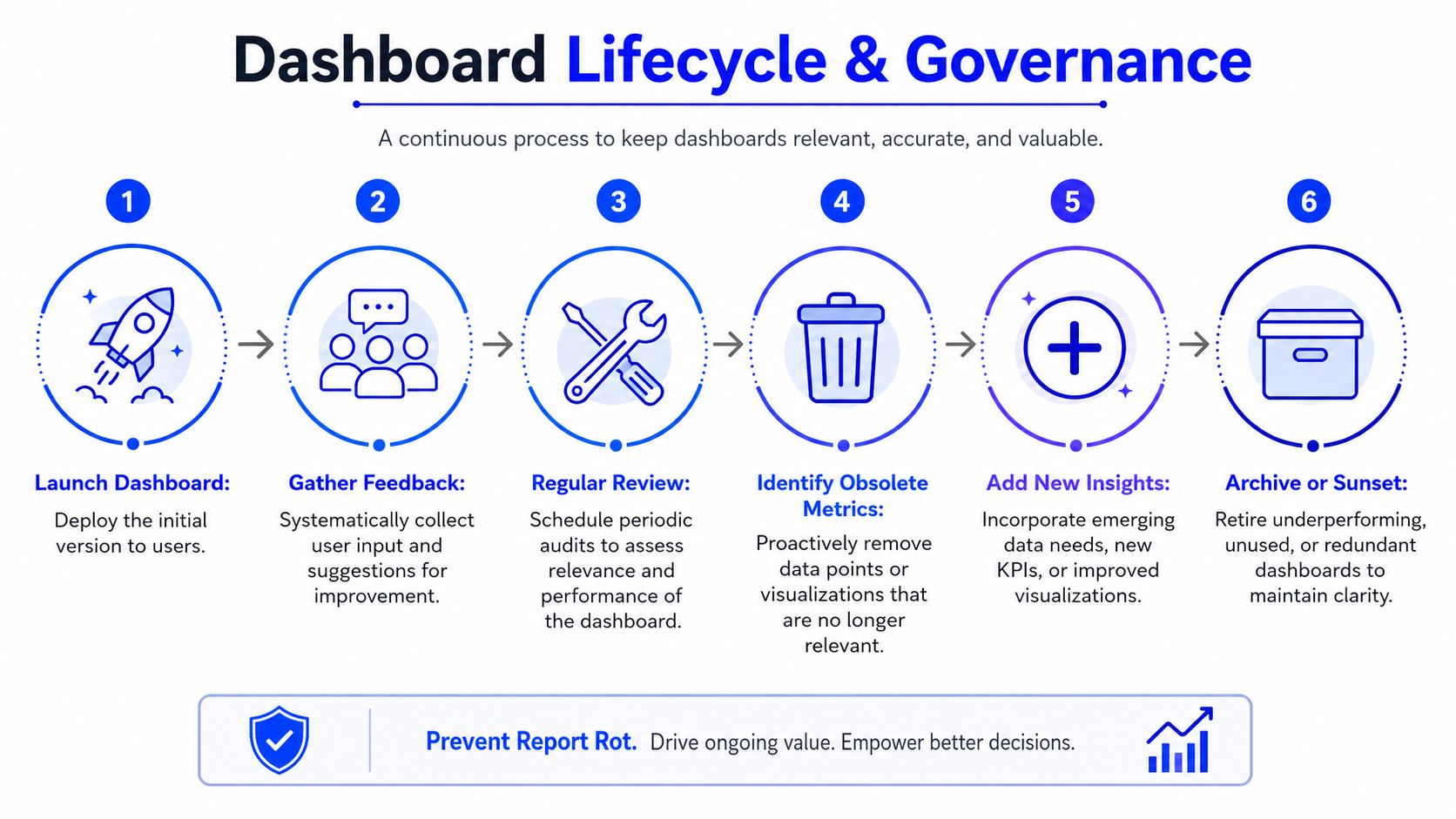
The problem is bigger than is commonly understood. Piwik PRO's dashboard guidance notes that 70% of dashboards become obsolete within 12 months because KPIs drift away from business goals.
Run a quarterly reporting audit
Put a recurring dashboard audit on the calendar every quarter for every active client. Don't make it optional.
Use a short checklist:
- Remove irrelevant metrics that no longer tie to active goals
- Review dashboard usage based on what clients ask about in calls
- Update commentary sections to reflect the current strategy
- Add new views carefully only when they support a real decision
Dashboards should evolve with the account. If the strategy changes and the dashboard doesn't, the report becomes archive material.
Set ownership before dashboards get messy
Governance only works when one person owns reporting hygiene. Usually that should be the account lead, with ops setting the standard.
Keep responsibilities clear:
- Account managers decide which metrics still matter.
- Ops leads maintain templates, naming rules, and delivery standards.
- Client success leads flag when the dashboard no longer matches what clients care about.
The agencies that handle reporting well treat dashboards like living deliverables. They prune them, rewrite them, and retire them when needed. That's how web analytics dashboards stay useful instead of becoming another ignored client portal.
Frequently Asked Questions for Agencies
Is Looker Studio enough for an agency
It can be, especially for small teams with strong internal discipline and someone comfortable managing connectors, templates, and troubleshooting. But many agencies outgrow it when client count rises and every account ends up with its own exceptions.
The issue usually isn't whether Looker Studio can produce a dashboard. It can. The issue is whether your team can keep branding, delivery, permissions, templates, and maintenance consistent across a growing client base without creating more ops work.
What should agency pricing look like
For agency reporting software, pricing by client count usually makes more sense than pricing by user, report, or dashboard. Agency teams grow, account managers change, and different people need access. You don't want reporting costs jumping because more staff need to see the same client data.
A cleaner model is one where agencies can add team members freely and build as many dashboards and reports as they need per client. That fits recurring service work much better than seat-based pricing.
What can you automate and what still needs a human
You should automate data pulls, scheduled delivery, white-label formatting, recurring dashboard generation, and template reuse. Those are process jobs.
You should not automate client judgment. A human still needs to decide which KPIs matter, what changed, why it matters, and what the agency should do next. Automation should remove repetitive reporting work so your team can spend more time on strategy and client communication.
If your agency is tired of spreadsheet-driven reporting, scattered client data, and delivery that never feels fully on-brand, take a look at Oviond. It's built for agency client reporting with white-label dashboards, automated delivery, custom domain support, unlimited users, and pricing based on client count. In other words, agency reporting that finally feels simple.
Related articles
Simplify marketing reporting today
Stop juggling multiple tools. Start presenting clear, automated reports your clients will love