
Oviond Blog
Google Analytics Report Generator: The Agency Workflow
Build a branded Google Analytics report generator for agencies — connect GA4, prep metrics, automate delivery, and skip the spreadsheet chaos.

Monday morning hits, and the reporting queue is already ugly. One account manager is chasing a broken Looker Studio link, another client wants last month's PDF resent with the correct logo, and someone in ops is trying to reconcile a dashboard that no longer matches the numbers in the spreadsheet export. That's why a Google Analytics report generator matters for agencies. It's not a nicer chart. It's the workflow that keeps client reporting from turning into a monthly scramble.
A proper generator connects GA4 cleanly, shapes the data into repeatable views, and pushes branded reporting out without hand-building each deliverable. For agencies managing 5 to 50+ clients, that difference shows up in how consistent the reports feel, how often they break, and how much back-and-forth your team has to absorb when a client asks, “Can you just send the latest version again?”
Table of Contents
- Why Agencies Need a Real Google Analytics Report Generator
- Connecting GA4 and Setting the Right Access Level
- Choosing the Metrics and Dimensions That Actually Matter
- Adding Calculated Metrics and Blending GA4 With Other Sources
- Building a Branded Template and White-Label Dashboard
- Scheduling Automated Branded Reports and Always-Current Dashboards
- Troubleshooting, Best Practices, and Common Pitfalls to Avoid
Why Agencies Need a Real Google Analytics Report Generator
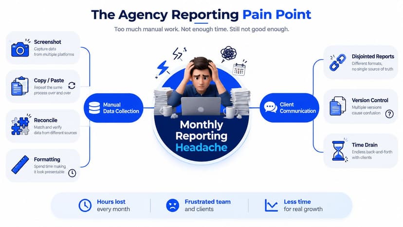
By Monday afternoon, the monthly reporting pile usually looks the same. Screenshots are copied out of one tool, chart exports come from another, and someone is still waiting on the right GA4 property access before the final deck can go out. The work isn't hard because analytics is mysterious. It's hard because agencies keep redoing the same packaging work for every client.
A real Google Analytics report generator changes that pattern. Google's reporting system is built around structured queries, not just pretty dashboards, and its reporting outputs can be highly granular, from daily active users over the last 7 days, to page views for the top 10 pages over the last 28 days, to active users per country in the last 30 minutes. That mix of short-cycle monitoring and longer-cycle analysis is exactly what agency reporting needs, because different clients care about different windows and different storylines. The point isn't to stare at more data. It's to build one repeatable reporting workflow that survives the next monthly cycle.
The real problem is not GA4, it's packaging
Most agencies don't fail at analytics collection. They fail at turning collection into client-ready delivery. One report is in Looker Studio, another is a spreadsheet, and a third exists only as a PDF somebody exported two weeks ago. Once branding, filters, and naming drift across clients, the team spends more time fixing presentation than explaining performance.
Practical rule: if your reporting process still depends on manual screenshot assembly, your problem is operational, not analytical.
That's why the report generator has to act like agency infrastructure. It needs to connect data, structure it, and deliver it on the agency's own terms, with branded output, a consistent domain, and client-specific KPI sets that don't require a fresh rebuild every month.
For teams that want a clean starting point for a GA4 connection, the Oviond GA4 data source guide is a useful reference. And if the client still hasn't connected analytics properly on their own site, the add analytics tracking guide is a practical reminder that bad inputs make bad reports.
Connecting GA4 and Setting the Right Access Level
A Google Analytics report generator only works if the connection is clean. Under the hood, GA4 reporting runs through Google's Data API, and a valid RunReportRequest needs at least one dateRanges entry, at least one dimensions entry, and at least one metrics entry. That structure matters because it forces the report to define time, breakdowns, and measures before anything comes back. In agency terms, that means the query has to be deliberate, not improvised.
Google also separates overview reports from detail reports, and that distinction is useful for teams that need to move from summary KPIs to deeper diagnostics without rebuilding the reporting stack each time. Overview views summarize broad topics, while detail views drill into a specific area of interest. That hierarchy maps well to agency workflows, where an account manager needs a quick read first and a more specific client discussion second. Google's documentation on the Data API basics covers that structure clearly, and it's the right place to sanity-check your setup before you automate anything.
Get the access model right before you scale
The common agency mistake is letting one analyst own every client connection from a personal Google account. That works until someone leaves, permissions change, or a client adds the wrong editor. A cleaner setup is to separate ownership from day-to-day reporting access, then decide whether a service account or OAuth better fits your operating model. The right choice depends on how often the connection needs to survive staff changes and how many people need access to client reporting.
Google's own reporting UI adds another boundary worth respecting. Only editors and administrators can see the customization option in detail reports, which means client-facing editing rights and reporting rights aren't the same thing. For agencies, that usually translates into tighter roles for account managers and broader setup rights for ops leads or analytics owners. If a person shouldn't change the report structure, they shouldn't have access that can reshape it.
Keep ownership stable, keep access documented, and test the permission path before the first automated send.
Before building the dashboard layer on top, confirm four things: the GA4 property is connected to the right account, the report owner won't disappear next quarter, the permission level supports the customization you need, and the report structure returns valid data. If any of those are shaky, the rest of the workflow will wobble too.
Choosing the Metrics and Dimensions That Actually Matter
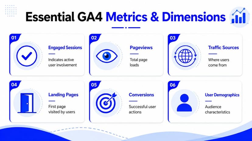
A bad report generator makes every client look busy. A good one makes each client look understandable. Google Analytics already revolves around structured topics like sessions, pageviews, engaged sessions, traffic sources, landing pages, demographics, and conversions, so the primary job is choosing which of those belong in the client story and which belong in the appendix.
GA4 reporting also has a built-in summary-to-detail rhythm. Google's own support docs describe overview reports and detail reports as the bridge between summary KPIs and deeper diagnostics, which is exactly how agencies should think about report design. Start broad, then go narrower only when the client has a question that needs it. The mistake is stuffing every dimension into the first view and hoping the client will sort it out.
Build the starter set around the client's business model
For a content-driven client, a starter set usually centers on engaged sessions, pageviews, landing pages, traffic sources, and a small set of conversion events tied to newsletter signups or contact intent. For a lead-generation client, the center of gravity shifts toward conversions, source quality, and landing page performance, with demographics used only when they help explain a channel pattern. Same platform, different question.
The point is not to prove you can surface everything. The point is to keep the first report readable enough that the client opens it again next month. Once a report gets overloaded, clients stop using it as a decision tool and start treating it like a data dump.
Practical rule: lead with 6 to 8 KPIs, then deepen with filters and secondary widgets instead of trying to make the first screen do everything.
That principle also fits the way Google's reporting tools are designed. The structure favors a defined set of metrics and dimensions, not a free-for-all. If you want a more operational way to decide what belongs in a report, the framework in kpis vs metrics what to include in your report helps teams separate client-facing KPIs from supporting metrics without cluttering the page.
The agency win is simple. Curated reports get opened. Overstuffed ones get ignored.
Adding Calculated Metrics and Blending GA4 With Other Sources
A GA4-only report answers what happened. A blended report starts answering why it happened. That's where agencies stop being data couriers and start acting like advisors, because the client doesn't need another isolated chart, they need context from paid media, search, and CRM activity tied together in one view.
Google's Reports Builder add-on shows the same operational flow many teams need: configure a report name, set a date range, add dimensions and metrics, then optionally apply ordering and filters before running the report. That sequence is worth copying in any report generator because it mirrors how people troubleshoot bad queries. First define the shape, then refine the output. If the UI hides that logic, users create messy definitions and blame the platform when the report comes back empty.
Calculated metrics turn data into decisions
A calculated metric is where the real value compounds. If a client wants to know whether paid traffic is efficient, the question is rarely about GA4 sessions alone. It's about how a metric from one source relates to another, like cost relative to engaged sessions, conversions, or qualified leads. Once you blend sources, the report stops being a mirror and starts being a working answer.
That's also where validation matters. Natural-language setup can speed up the first pass, but it still has to resolve to valid dimension and metric combinations. If the query logic is off, the report doesn't execute the way the user expects. Good tools surface those errors clearly, instead of letting the agency discover them during client review.
For teams standardizing blended reporting, Oviond's blended query builder update is relevant because it reflects the same practical idea, make the combined view easier to configure and easier to reuse across accounts.
Use the same blend patterns across the portfolio
Once you've defined the right mix for one client, reuse it. A content client may need GA4 plus Search Console to show which pages attract search traffic. A lead-gen client may need GA4 plus ads and CRM data to show which sessions become usable pipeline. The blend changes, but the workflow shouldn't.
Oviond is one option agencies use for this kind of multi-source setup, because it combines calculated metrics, blended queries, and agency reporting in one place. That's useful when the goal is fewer custom one-offs and more reusable widgets across the client base.
Building a Branded Template and White-Label Dashboard
The report becomes the agency's product once the template exists. Without that layer, every deliverable is a one-off assembly job. With it, the team can standardize layout, branding, and widget placement, then clone the same structure across new accounts without rebuilding from zero.
That matters because agencies don't just need data. They need a report that feels native to the relationship. The logo, color palette, footer treatment, and domain all shape whether the client sees a polished service or a stack of borrowed tools.
Standardize the pieces that clients notice first
A strong template usually starts with the header, the report title, and a small set of recurring sections. Then it adds the brand layer, logo placement, approved colors, and a layout that keeps the same key widgets in the same place every time. If the agency uses a custom domain and removes vendor branding, the report feels like part of the service instead of a third-party add-on.
The mistake is over-designing every client separately. A template should reduce choice, not invite endless reinvention. Once the core structure is saved, the team can copy it into each account, swap the data source, and keep the client experience consistent.
The most underused feature in agency reporting isn't a fancy chart, it's the saved template.
That's the difference between a dashboard library and a reporting operation. One is built for browsing. The other is built for repetition.
| White-Label Elements Worth Standardizing | What to Set | Why It Matters |
|---|---|---|
| Header | Client name, report title, agency mark | Keeps every report recognizable |
| Footer | Remove vendor clutter, add agency details | Makes delivery feel native |
| Colors | Approved brand palette | Prevents visual drift across clients |
| Domain | Custom client-facing URL | Supports a cleaner white-label experience |
| Email sender | Agency-branded sender name | Improves consistency in automated delivery |
For agencies formalizing that layer, how to white-label your digital marketing reports and dashboards is a practical reference point. The general rule is simple. Build the template once, lock the style system, and let the widgets change per client rather than rebuilding the whole experience.
Scheduling Automated Branded Reports and Always-Current Dashboards
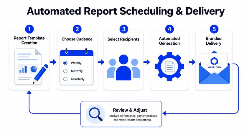
Once the template is in place, scheduling is where the workflow starts paying for itself. Agencies usually don't need one universal cadence. They need different rhythms for different client types, weekly for active accounts, monthly for retainers, quarterly for business reviews, and ad hoc for special campaigns. The trick is setting those schedules once, then letting the platform handle delivery without multiplying the ops load.
Google Analytics reports can be customized with filters, date ranges, comparisons, share and export options, insights, and chart or dimension customization, and Google notes that only editors and administrators can see the customization option. That permission reality matters when you're handing off reporting across account teams, because scheduling and customization often depend on different access levels. If the wrong person owns the setup, the delivery chain becomes fragile fast.
Delivery should feel branded, not bolted on
Automated delivery by email or by link is what replaces the PDF chase. When the sender name, domain, and dashboard branding all match the agency, the client sees one service instead of a patchwork of tools. That consistency matters more than many expect, because clients notice when the report arrives cleanly and the link still works next month.
Always-current dashboards solve the version problem. No more wondering whether someone exported a file before the latest data refresh. The client opens the link and sees the current view, which reduces the noise around “which version is this?”
The AI-assisted layer helps here too. On-platform summaries can give account managers a first draft of what changed, and MCP-assisted setup can cut down the manual assembly work when the agency is spinning up a new client dashboard. That doesn't replace judgment. It just gives the team a cleaner starting point.
The gain isn't that your team saves hours on exports. It's that ops gets the headspace to handle more clients without turning every reporting cycle into a fire drill.
Troubleshooting, Best Practices, and Common Pitfalls to Avoid
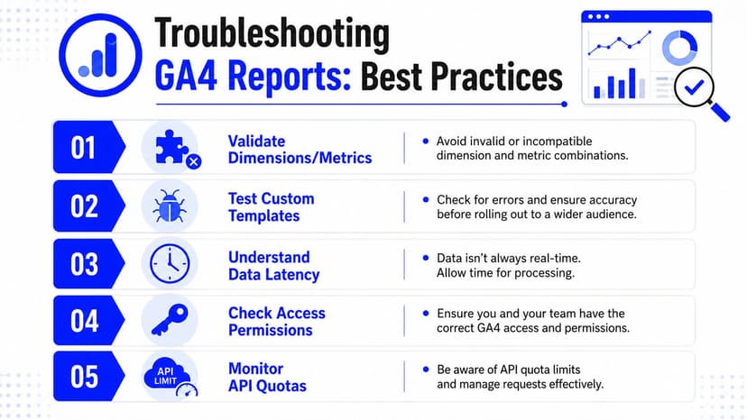
The biggest reporting failures are usually boring. A metric combination doesn't return data, a template gets edited differently for each client, or permissions shift and the scheduled report stops behaving. None of that is glamorous, but all of it shows up in client-facing workflows, which is why the operating discipline around the report generator matters as much as the software itself.
Google's reporting tools already hint at the failure points. The Data API expects valid combinations of date ranges, dimensions, and metrics. Google's detail reports also expose customization only to editors and administrators, so access changes can affect what people can do even when the dashboard still opens. Those are the pressure points agencies need to watch.
Run the same pre-flight checks every time
Before you launch a new client into an automated workflow, confirm the connection, permissions, branding, and schedule. Then do one human review of the first send before you let the report run unattended. That first pass catches the rough edges that don't show up in template design, like a blank widget, a stale label, or a client who can't access the shared link.
- Validate Dimensions and Metrics: Check that the combinations you use return data before you build on top of them.
- Test Custom Templates: Open the report the way a client will, then fix any layout drift or broken widget settings.
- Check Access Permissions: Confirm the right Google account roles before scheduling delivery.
- Review Branding: Make sure the white-label styling, sender name, and domain all match the agency.
- Dry-Run the Schedule: Send the first version to internal reviewers before the client receives it.
If the first automated send hasn't been reviewed by a human, it's not ready to be client-facing.
That's the line agencies should keep in mind. A good Google Analytics report generator won't rescue sloppy setup, but it will make disciplined setup repeatable. Once the workflow is stable, the team can stop rebuilding monthly reports and start running a reporting system that clients can trust.
If your agency is still stitching GA4 screenshots, spreadsheet exports, and branded PDFs together by hand, Oviond gives you a cleaner way to handle client reporting, branded dashboards, and automated delivery in one place. If you want the agency workflow to feel simpler, visit Oviond and see how white-label reporting can replace the monthly scramble.
Related articles
Simplify marketing reporting today
Stop juggling multiple tools. Start presenting clear, automated reports your clients will love