
Oviond Blog
Social Media Performance Dashboard: An Agency Guide
Learn how a social media performance dashboard helps agencies track metrics, prove ROI, and optimize client campaigns in 2026.

The first Monday of the month arrives, and reporting is already behind. An account manager is exporting data from Meta, TikTok, LinkedIn, YouTube, X, Pinterest, and Threads. Someone else is copying figures into a spreadsheet. A client wants the report early, another wants a different date range, and the agency owner is wondering why recurring reporting still consumes the team's best working hours.
That's the problem a social media performance dashboard should solve. It shouldn't be a decorative wall of charts or another place to check numbers manually. It should give your agency one dependable reporting system, keep client delivery on schedule, and make the monthly conversation about decisions instead of data collection.
Table of Contents
- Why Agencies Need a Different Kind of Social Media Performance Dashboard
- Choosing the KPIs That Actually Belong on the Dashboard
- Picking the Right Data Sources and Connections
- Designing a Layout That Tells a Client Story
- Building Calculated Metrics and Goals That Match Client Outcomes
- Scheduling, Automation, and the Recurring Delivery Rhythm
- White-Labeling, Custom Domains, and How Clients Experience the Brand
Why Agencies Need a Different Kind of Social Media Performance Dashboard
Agencies don't report on one account. They report across multiple clients, platforms, objectives, approval processes, and brand identities. A dashboard built for one internal marketing team often falls apart when account managers need to duplicate it across a growing client roster.
The recurring pain is familiar. Platform screenshots sit beside CSV exports, manually edited slides, and notes from the previous month. One client receives a PDF, another gets a link, and a third asks why the figures in the presentation don't match the native platform. The team spends its Monday reconstructing what happened before anyone can discuss what should happen next.
A live dashboard changes the operating rhythm. Connected sources create a shared view of performance, automated delivery removes the need to remember every export, and consistent date ranges reduce avoidable disputes. The point isn't to show every available metric. The point is to give the agency and client the same current version of the story.
Operating rule: Your dashboard should make the next client decision easier. If it only makes the report look fuller, it's costing more than it's contributing.
The dashboard becomes part of the service
A recurring report is more than a file. It signals how your agency works. A clean, branded dashboard tells the client where performance stands, what changed, and what the team recommends. A collection of screenshots tells them the agency assembled evidence after the fact.
That distinction matters as client count grows. Manual reporting creates hidden variation between account managers, while a standardized dashboard gives everyone the same foundation without forcing every client into an identical story. Agencies still need judgment, commentary, and client-specific recommendations. They shouldn't need to rebuild the plumbing every month.
A 2026 benchmark compilation analyzed over 70 million posts across Instagram, TikTok, YouTube, LinkedIn, Facebook, X, Threads, and Pinterest, and said its figures were refreshed against multiple industry sources, with the report last updated in May 2026. The benchmark compilation illustrates the scale and breadth now expected from cross-platform performance analysis.
That makes dashboarding an operating-model decision, not a BI software decision. Choose a system that supports the cadence your agency has promised, the client experience you want to deliver, and the number of accounts your team expects to manage.
Choosing the KPIs That Actually Belong on the Dashboard
Start with the client decision, not the connector. Ask what the client needs to decide in the next reporting cycle, then work backward to the few measures that support that decision.
Separate input metrics from outcome metrics. Posting frequency, spend, reach, and impressions describe the activity or distribution behind performance. Engagement, clicks, leads, lead quality, conversions, and revenue describe what that activity produced. Inputs belong on the dashboard when they explain an outcome. They shouldn't compete with the outcome for attention.
Use this filter for every tile:
- Awareness: Keep reach, impressions, video views, and follower growth when the client needs to understand distribution and audience momentum.
- Community: Surface engagement rate, comments, shares, saves, and meaningful interaction patterns when the account's job is audience connection.
- Lead generation: Prioritize clicks, conversion actions, cost per lead, and lead quality. Reach can support the explanation, but it shouldn't lead the page.
- E-commerce: Show traffic, conversions, revenue, and return measures when the available tracking supports them. Social engagement is context, not proof of commercial value.
Raw likes, shares, and follower counts rarely deserve the hero position. They can explain why a post or campaign gained attention, but they don't establish whether the activity created business value. The guide to measuring social media beyond vanity metrics makes the same distinction between visible activity and credible connections to conversions, lead quality, CAC, and downstream revenue.
Choose platform-aware measures
Don't copy the same KPI structure across every network. Benchmark data shows a clear engagement difference, with TikTok listed at 2.60% engagement by followers and Facebook at 0.15% in one 2026 benchmark report. The same source reports an average of 5 posts per week on both Instagram and TikTok. Socialinsider's benchmark data also reports 27.6% median TikTok engagement in Q4 2025, with median interactions at twice Instagram's level and 20 times Facebook's level, while Instagram Reels and Carousels showed 44% higher median engagement than image-based posts.
Those figures aren't universal targets. They're a warning against treating every platform as if it behaves the same way. Use engagement by followers where it helps compare audience response, then pair it with platform-specific format and distribution context.
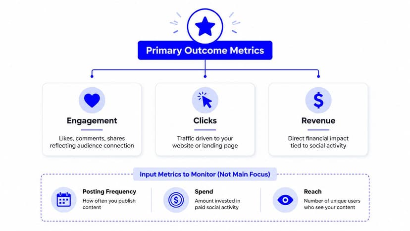
For a practical definition of the metrics and how to analyze them, use this social media dashboard metrics guide. Keep the first view deliberately small. If a number can't change the plan, budget, creative, audience, or reporting conversation, move it into a supporting view or remove it.
Picking the Right Data Sources and Connections
Connection breadth is useful only when it matches the client mix. An agency serving social-first accounts may need Meta, LinkedIn, TikTok, YouTube, X, Pinterest, and Threads. Another agency may need those sources plus Google Analytics 4, Search Console, Mailchimp, and a CRM to connect social activity with traffic, leads, and customer movement.
Map sources by client tier before onboarding the next account. A core social package might include the client's active organic and paid social accounts. A lead-generation package can add GA4, landing-page data, and the CRM. A broader digital package may include search, email, and e-commerce sources. Standardization makes setup repeatable without pretending every client has the same objectives.
Three checks before adding a connection
Breadth comes first. Confirm which platforms the client uses and which accounts the agency has permission to access. Don't add connectors just because they're available.
Refresh behavior matters. Decide whether the client needs a live view for ongoing account management, a daily operational check, or a scheduled monthly report. The refresh expectation should match the decision, not a vague promise that the data is current.
Setup cost belongs in onboarding. If a client asks for a metric a platform doesn't expose natively, decide early whether it requires a custom query, a Google Sheets import, or a calculated metric. Discovering that limitation on delivery day is how a clean reporting process turns into spreadsheet work.
A source checklist should include account access, profile selection, date-time settings, campaign naming, attribution rules, and the fields needed for the client's agreed KPIs. Test the connection before building the polished layout. A dashboard that looks finished but depends on an unverified token is not finished.
For Instagram-specific setup, document the account permissions and fields you'll use with this Instagram data source overview. Escalate to a custom import only when the metric supports a real client decision and can't be produced reliably from the standard source. Otherwise, leave it out.
Designing a Layout That Tells a Client Story
A client shouldn't have to study the dashboard to find the answer to the first question. Put that answer at the top, then show the evidence beneath it.
Use a three-zone layout:
- Topline zone: Place the two or three measures that define success for this account. For a lead-generation client, that might be qualified leads, cost per lead, and conversion rate. For a community account, it may be engagement quality, follower growth, and meaningful comments.
- Driver zone: Explain movement in the topline numbers with reach, spend, posting frequency, content format, clicks, and top-performing posts.
- Deep-dive zone: Give the agency platform, campaign, audience, and content breakdowns needed for planning. Operational detail belongs here, not at the top of the client view.

Build the page in reading order
Lead with the question the client will ask first, usually whether performance is growing, declining, or holding steady. Follow with a short explanation of what caused the movement. End with the evidence your team needs to decide what to change next.
That sequence prevents the common homepage mistake. Agencies often fill the first screen with attractive tiles because the builder makes it easy. The result is a dashboard that looks busy but forces the client to assemble the narrative themselves.
Templates give you a starting structure without locking every account into the same report. A digital marketing template can cover broad performance, a social ads template can focus on paid delivery, and an e-commerce template can prioritize commercial outcomes. Edit the order, labels, commentary, and platform breakdown for the client.
For chart selection and report structure, this guide to data visualizations in reports and dashboards offers a useful design reference. Your builder should support charts, text, notes, reusable assets, and filters without requiring the team to rebuild each page from scratch.
A good final test is simple. Hide the deep-dive section and read only the topline and drivers. Can the account manager explain what changed and what happens next? If not, the layout needs work.
The dashboard can also support a broader walkthrough of how reporting systems are assembled:
Building Calculated Metrics and Goals That Match Client Outcomes
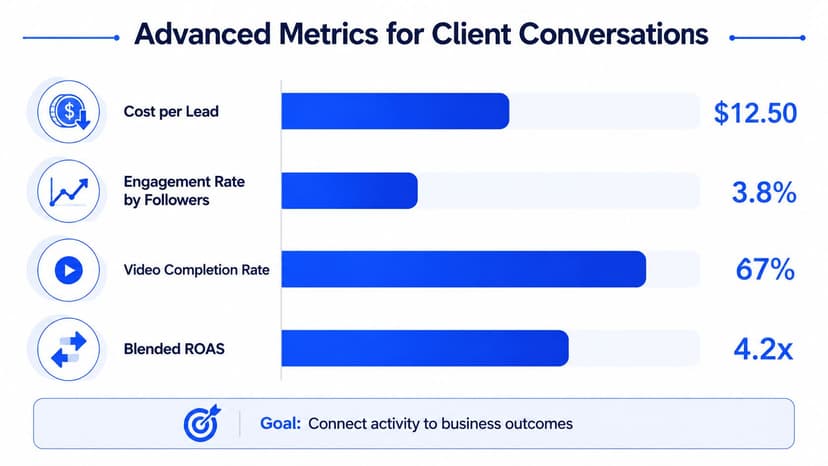
Native connector fields are a starting point, not a finished reporting model. Clients ask questions that require agency-defined math, such as how much each lead costs, whether engagement is healthy for the audience size, or how close the account is to a quarterly target.
Build repeatable calculations as calculated metrics. Use goal tiles for target progress. Reserve custom queries for analysis that's specific to one client, campaign, or reporting question.
Useful calculations include:
- Cost per lead: Paid spend divided by the agreed lead count, with the lead definition documented beside the metric.
- Engagement rate by followers: Total selected interactions divided by the relevant follower base, using a consistent time window.
- Video completion rate: Completed views divided by the chosen video-view denominator, provided the source definitions remain consistent.
- Blended return: A combined paid and organic view only when the agency has a defensible revenue and cost model.
- Goal progress: Current performance compared with a target, displayed alongside the trend that explains whether the account is on course.
Use blended metrics carefully
A practical cross-platform engagement formula combines Instagram, TikTok, and LinkedIn using audience-size weighting. In plain terms, calculate engagement for each network, multiply each rate by that platform's relevant audience base, add the resulting interaction estimates, and divide by the combined audience base.
That approach is more defensible than averaging three percentages as if each audience were the same size. Document the included platforms, interaction fields, audience denominator, and date range in the dashboard notes. If the client adds a platform, update the calculation deliberately and test the result before delivery.
For goals, overlay a quarterly follower target on a weekly growth line. The target gives the client a destination, while the line shows whether current performance is moving toward it. Don't confuse progress against an internal goal with performance against the market.
Benchmarking provides context, but it doesn't make a weak outcome acceptable. If a client reports a 1.8% engagement rate, compare it with the relevant platform, audience denominator, content mix, and objective before calling it healthy or lagging. Broad benchmarks can inform the conversation, but they don't replace account-specific judgment.
Reporting guidance recommends clear definitions, consistent collection methods, descriptive statistics, and uncertainty measures such as 95% confidence intervals for higher-level engagement comparisons. The social media metrics literature supports the practical discipline here: document what you collected, how you calculated it, and what the comparison can't prove.
Scheduling, Automation, and the Recurring Delivery Rhythm
Automation works when it follows the agency's actual calendar. It fails when someone turns on every available notification and calls the process finished.
Use a fixed rhythm. On Monday, the account team reviews the live dashboards, checks unusual movement, and writes the interpretation while the month is still easy to recall. On Wednesday, the approved client report goes out through a scheduled PDF, link, or embedded dashboard. On the first day of the month, leadership reviews the multi-client view, delivery status, and accounts needing attention.
That rhythm separates internal quality control from client delivery. It also gives account managers a clear point at which they stop collecting data and start explaining it.
Match the delivery format to the client
A PDF suits a formal monthly record. A live link suits clients who want to check current performance between meetings. An embedded dashboard works well inside a client portal. A custom sender keeps the email aligned with the agency relationship instead of making the delivery look like an automated message from an unfamiliar vendor.
Always-current refresh matters because a client shouldn't open a dashboard and see a stale version of the account. At the same time, don't promise a refresh behavior the connectors can't support. Set expectations around the source and the reporting cadence.
Two mistakes cause most scheduling problems:
- Over-scheduling: Sending several reports that nobody uses creates noise and trains clients to ignore delivery emails.
- Under-scheduling: Waiting for someone to remember the export turns a recurring service into a recurring emergency.
Practical rule: If a report follows a fixed cadence in the real world, configure that cadence in the reporting platform too.
Review automation periodically. Remove unused sends, confirm recipients after team changes, and keep one accountable owner for delivery health. A scheduled report still needs an agency person responsible for the story inside it.
White-Labeling, Custom Domains, and How Clients Experience the Brand
White-label reporting changes the client's interpretation of the work. A vendor-branded URL makes the client feel as if the agency has handed over access to someone else's product. A branded dashboard, agency domain, and recognizable sender make the reporting environment feel like part of the service they bought.
White-label client reporting means delivering analytics, dashboards, and summaries under the agency's identity rather than the software vendor's branding. Common elements include the agency logo, colors, name, domain, and sender details, as described in this overview of white-label client reporting for agencies.
Complete the client-facing layer
Turn on the elements that clients notice:
- Custom domain: Use a dashboard URL that reflects the agency's own client experience.
- Custom email sender: Send the report from a recognizable agency address or team identity.
- Branded login: Keep the logo, colors, and language consistent from the invitation through the dashboard.
- Agency-attributed PDF cover: Make the first page answer what the report covers, which period it represents, and who prepared it.
- Consistent naming: Use the same client, campaign, and reporting-period names across dashboards, files, and email subjects.
These details aren't decoration. They reduce the moment of doubt when a client asks, “What tool is this?” The stronger conversation starts with, “What should we change next quarter?” That's a better client experience and a more useful account-management conversation.
Use a delivery pre-flight check
Run the same check before every client delivery. Consistency matters more than heroic last-minute inspection.
Data freshness and dates: Confirm the connectors synced, the intended accounts are selected, and the date range matches the reporting period. Time-zone mismatches can pull a partial day into one report and leave it out of another.
Metric definitions: Confirm that “engagement” means the same thing across the agency's reports and that the client knows which interactions are included. A metric label without a definition invites unnecessary debate.
Brand consistency: Check the logo, palette, custom domain, sender email, PDF cover, and client name. A single wrong logo can make a polished report look copied.
Story quality: Read the cover summary as if you were the client. Does it answer the first question, explain the main movement, and state what the agency recommends next?
The most common technical failures are predictable. A client password reset can disconnect a token. A new platform can break a calculated metric if the formula expects a fixed set of sources. A date setting can shift the report window. A PDF cover can still display the previous month. None of these should reach the client.
Don't confuse correct data with a useful report
A technically accurate dashboard can still generate follow-up emails if the story is unclear. Clients don't need a catalogue of everything that happened. They need the agency to identify the meaningful change, explain the likely driver, separate evidence from interpretation, and recommend the next action.
Give account managers a simple internal script:
- What changed?
- What caused or contributed to it?
- What does it mean for the client's objective?
- What will the team do next?
The tool should support that script, not replace it. Looker Studio can work when a team is comfortable maintaining its data model and templates. AgencyAnalytics, Whatagraph, and Swydo each offer agency-oriented reporting workflows, so compare connector coverage, customization, branding, delivery, and pricing against your client mix rather than choosing from a feature checklist.
Oviond positions itself as an agency reporting platform with live dashboards, scheduled branded reports, white-label delivery, custom domains, 60+ integrations, calculated metrics, goals, templates, unlimited reports, unlimited dashboards, and unlimited users. It also supports AI and MCP-assisted setup, alongside sources covering social, analytics, advertising, search, email, CRM, and e-commerce. Those capabilities make it a relevant option when an agency wants social reporting inside one broader client reporting process rather than another isolated platform.
Before you standardize the stack, test it against a real monthly deadline. Connect a representative client, build the topline and driver views, schedule delivery, apply the brand layer, and run the pre-flight check. If the process still depends on spreadsheet repair, manual screenshots, or one person remembering the final export, the dashboard hasn't solved the operating problem.
For a practical white-label setup, use this guide to white-labeling digital marketing reports and dashboards. Then document the finished process so every account manager can deliver it consistently.
Oviond brings social, analytics, paid media, search, email, CRM, and e-commerce data into branded dashboards and automated client reports, with white-label delivery, custom domains, calculated metrics, goals, and 60+ integrations. Visit Oviond to replace spreadsheet-heavy monthly reporting with an agency-native workflow your team can repeat across every client.
Related articles
Simplify marketing reporting today
Stop juggling multiple tools. Start presenting clear, automated reports your clients will love