
Oviond Blog
Website Analytics Dashboard: Build Client Reports Faster
Build a website analytics dashboard to streamline client reporting. Master core metrics, design, and essential tools for agencies. End manual report struggles.

If you run an agency with a growing client roster, you already know the monthly reporting crunch. Someone exports from GA4, someone else checks Google Ads, another person grabs Meta screenshots, and then an account manager tries to stitch the whole story together in Slides before the client meeting. By the time the report is out, half the team is tired of looking at it, and the client still asks the same question: “What changed, and what should we do next?”
That's why a website analytics dashboard matters so much for agencies. Not because dashboards are fashionable, and not because clients want more charts. It matters because reporting is an operations problem. If your team handles recurring client reporting across multiple accounts, the dashboard isn't just a data view. It's the system that keeps delivery clean, communication clear, and margins from getting eaten by manual work.
A good setup replaces version chaos, scattered tabs, mismatched branding, and report-by-report rebuilding. It gives account managers a stable reporting workflow, gives clients a cleaner experience, and lets the agency add more clients without automatically adding more reporting headcount. That's the point. Agency reporting that finally feels simple.
Table of Contents
- The End of Manual Client Reporting
- Anatomy of an Agency Website Analytics Dashboard
- Designing Dashboards That Clients Actually Use
- Dashboard Templates for Key Agency Services
- Choosing Your Agency Reporting Platform
- How to Build Your First Automated Dashboard
The End of Manual Client Reporting
Manual reporting usually breaks before most agencies admit it. It starts as a workable process for a small client list. Then the agency adds a few retainers, expands into more channels, and suddenly every reporting cycle turns into a mini production sprint.
One account manager is checking date ranges. Another is fixing copied charts that don't match the source platform. Someone notices the branded cover slide uses an older logo. A client asks for one more KPI, which means another export, another screenshot, another round of revisions. None of that improves strategy. It just keeps the report alive long enough to send.
Effort isn't the only problem. It's operational drag. When reporting depends on people pulling from too many places, the agency creates avoidable risk in three areas:
- Data handling gets messy. Metrics live across analytics, paid media, search, social, and CRM tools, so teams keep reconciling numbers by hand.
- Client communication gets inconsistent. One client gets a polished deck, another gets a rushed PDF, and another gets a link with no context.
- Scaling gets expensive. Every new client adds recurring reporting load, even when the service itself is running smoothly.
Practical rule: If your monthly reporting process depends on screenshots and copy-paste, you don't have a reporting system. You have a reporting workaround.
This matters even more now because clients are watching visibility across more surfaces than standard web traffic and ad performance. If your agency is also trying to explain how brand content shows up in AI-generated answers, tools that help you track AI content visibility add useful context alongside traditional website reporting.
The fix is moving from one-off report production to a repeatable reporting system. That means centralizing data, standardizing layout, keeping reports branded, and making delivery predictable. The jump from manual reporting to automated delivery changes the whole operating model, which is why the trade-off between manual reporting and automated digital marketing reporting is bigger than most agencies first assume.
A website analytics dashboard, in agency terms, isn't just where numbers live. It's the layer between your team's work and the client's understanding of that work. When that layer is clean, clients ask better questions, account managers spend less time defending formatting choices, and reporting stops feeling like a monthly fire drill.
Anatomy of an Agency Website Analytics Dashboard
A solid agency dashboard works like a well-built client pack. It pulls the right sources together, puts the important metrics in the right order, and adds enough explanation that the client can follow the story without a live tour every time.
One place for the data that matters
The foundation is multi-source reporting. Agencies almost never answer client questions with one platform alone. Website performance connects to ad spend, search visibility, landing page behavior, and conversions. If those stay split across tabs, the dashboard becomes another partial view instead of the client reporting hub it should be.
At minimum, most agencies want a website analytics dashboard to bring together tools such as GA4, Google Ads, Meta Ads, Google Search Console, and often a CRM or lead source. The goal isn't to show every available metric. The goal is to let an account manager answer common client questions without jumping between logins.
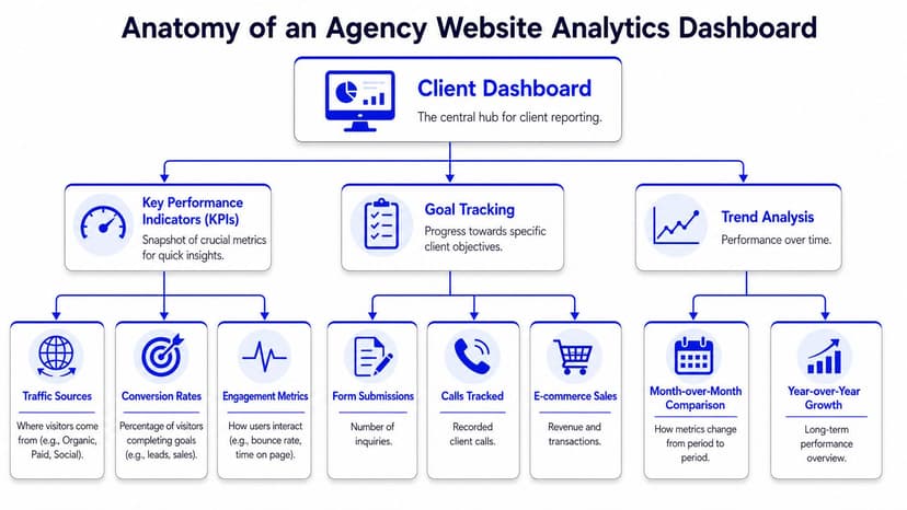
If you want a useful baseline for how these views are typically structured, this guide on what a digital marketing dashboard is is a good reference point for agency teams.
The metric groups clients can actually follow
Most client-facing dashboards work better when metrics are grouped into plain categories instead of platform-based sections. That keeps the conversation tied to outcomes rather than tool names.
A practical structure looks like this:
| Group | What it answers | Example metrics |
|---|---|---|
| Acquisition | How are people finding the site? | Traffic source mix, channel sessions, landing page entry points |
| Behavior | What are visitors doing after they arrive? | Engaged sessions, top pages, on-site engagement, site path patterns |
| Conversion | Did the visit turn into business value? | Form submissions, booked calls, purchases, lead events |
This grouping sounds simple, but it solves a common agency problem. Clients don't naturally think in platform dashboards. They think in cause and effect. “Did the campaign bring better traffic?” “Did the new page hold attention?” “Did leads improve?” A good dashboard mirrors that logic.
What doesn't work is dumping every available widget into one screen. Too many charts flatten the story. Clients stop scanning, account managers stop using the dashboard live in meetings, and the report becomes decorative.
A client dashboard should answer the next obvious question before the client has to ask it.
The layer most dashboards miss
The most underrated part of a website analytics dashboard is the narrative layer. Charts alone rarely explain enough. Agencies need room for commentary, notes, goal tracking, and short summaries that translate performance into decisions.
That layer can include:
- Short written summaries that explain what changed and why it matters
- Annotations for landing page launches, tracking fixes, campaign shifts, or seasonal events
- Goals and targets that show progress in context
- Channel-specific notes that keep account managers from repeating the same explanation on every call
Many Looker Studio builds frequently fail for agency use. They can be flexible, but they often drift into custom-report chaos. One dashboard says “Users,” another says “Traffic,” another uses internal shorthand the client doesn't understand. AgencyAnalytics, Whatagraph, and Swydo generally reduce that kind of inconsistency because they're built more directly for recurring client reporting. The trade-off is that every platform handles white-labeling, multi-client workflow, and template standardization a little differently.
For agencies, the winning setup is usually the one that keeps the structure repeatable without making every client report feel generic. That's the balance worth protecting.
Designing Dashboards That Clients Actually Use
A client dashboard can be accurate and still fail. Agencies run into this all the time. The data is correct, the integrations work, and the charts are technically fine, but the client barely opens the dashboard and still asks for a custom recap over email.
That usually means the dashboard was built as a data container instead of a communication tool.
Clients don't want a database
Clients don't need to see everything your team can access. They need to understand performance fast, in plain language, with a clear path from activity to result. The dashboard should help them grasp the account, not admire the setup.
Start with the main business objective at the top. If the client cares most about leads, make lead generation the first thing they see. If the retainer centers on SEO growth, lead with organic visibility, landing page performance, and conversion contribution from search. The top of the page should answer the reason the client is paying you.

A cluttered dashboard creates the same feeling clients get when they open a messy reporting deck. They know effort went in, but they can't find the point. That's why the argument behind why less is more on a digital marketing dashboard holds up so well in agency work.
Three design choices make the biggest difference:
- Put the primary goal first. Don't start with vanity traffic charts if the client is judged on leads or sales conversations.
- Group related metrics together. Keep SEO with SEO, paid media with paid media, and site conversions where they naturally connect to channel performance.
- Rename widgets in normal language. “Lead form submissions” works better than platform labels or event naming conventions.
Good dashboard design reduces account friction
A dashboard people use has a visible reading order. Top-line outcome first. Supporting channel views next. Detail further down. That hierarchy does more than improve usability. It changes the tone of client conversations.
When the client can scan the page and understand the headline, the account manager spends less time guiding them through the mechanics. That leaves more room for judgment, recommendations, and next steps.
Agency-side benefit: Every element in a dashboard should reduce explanation, not create more of it.
White-labeling matters here too. Not because clients obsess over software branding, but because agencies need a consistent delivery experience. Branded dashboards, custom domain access, and clean report styling help the reporting layer feel like part of the agency service, not a separate vendor tool bolted on at the end.
There's also a retention angle that gets overlooked. When the dashboard looks on-brand, uses the client's language, and stays always-current, the agency appears organized and in control. When reporting arrives with mixed logos, awkward links, and inconsistent layouts, clients notice. They may not complain directly, but it weakens confidence.
A good client dashboard does one thing especially well. It protects the value of your work from being buried under avoidable presentation mistakes.
Dashboard Templates for Key Agency Services
The easiest way to scale client reporting is to stop starting from scratch. Agencies do better with templates that match the service being delivered, then adapt the details per client. That keeps reporting consistent while still leaving room for account-specific context.
SEO performance dashboard
For SEO retainers, clients usually want to know three things. Is organic visibility improving, is the site attracting relevant traffic, and is that traffic turning into meaningful actions?
A practical SEO dashboard template often includes:
- Organic sessions trend so clients can see movement over time without digging through GA4
- Search Console query or landing page visibility to connect performance to search demand
- Top organic landing pages because those pages often explain both wins and drop-offs
- Engagement by landing page to show whether the traffic is useful after the click
- Goal completions from organic traffic so SEO isn't framed as traffic alone
- Technical or annotation panel for content releases, site fixes, or migration notes
This template works because it supports the story agencies typically tell in SEO meetings. “These pages gained traction.” “This cluster is starting to pull in better visits.” “These pages need stronger conversion paths.” It moves the client away from obsessing over isolated rank checks and toward performance that matters.
Paid media dashboard
Paid media clients want cleaner accountability. They need to see spend, efficiency, conversion outcomes, and campaign direction in one place. A dashboard helps when it prevents the paid team from rebuilding the same narrative every month.
The core widgets usually look different from SEO because the decision cadence is tighter:
| Widget | Why it belongs |
|---|---|
| Spend by platform or campaign | Keeps budget discussions grounded |
| Conversions by campaign | Shows which campaigns are driving the target action |
| Cost efficiency view | Helps explain why some campaigns deserve more or less spend |
| Landing page performance | Connects ad results to post-click quality |
| Creative or audience notes | Gives context for testing and changes |
| Trend chart over the reporting period | Stops clients from overreacting to a single snapshot |
Agencies often overbuild these dashboards. They include every ad metric available, and the client ends up staring at a wall of acronyms. The better approach is narrower. Show what supports budget and optimization decisions. Keep the rest available if the account manager needs to drill deeper.
Clients rarely ask for more paid media metrics. They ask for clearer paid media explanations.
Full-funnel marketing overview
Some clients don't want channel-specific reporting first. They want to know how the whole program is working together. That's where a full-funnel marketing overview earns its place.
This template is useful for agencies managing multiple services under one retainer. SEO, paid media, social, email, and website performance may all matter, but the dashboard still needs one story.
A strong full-funnel layout often includes:
- Top-line conversions or lead volume as the opening metric
- Channel contribution summary showing where results are coming from
- Website engagement overview to indicate traffic quality
- Top landing pages across channels to reveal where attention is landing
- Conversion path or source summary for channel interplay
- Goal progress module tied to the client's stated objective
- Written summary panel with actions, not just observations
This kind of dashboard helps account managers avoid fragmented reporting calls where each specialist presents in isolation. Instead of hearing separate updates from SEO, PPC, and content, the client sees one connected view of performance.
That difference matters operationally. A shared overview reduces repeated explanation, gives client-success teams a cleaner handoff point, and makes monthly reporting easier to scale across a multi-client portfolio.
Choosing Your Agency Reporting Platform
Most agencies don't choose a reporting platform once. They grow into the need for one.
The usual path agencies take
The early stage is familiar. Reporting lives in spreadsheets, screenshots, and slide decks. It's flexible, and for a small book of clients, it can hold together. But once reporting becomes recurring across multiple channels and multiple account managers, the process gets fragile fast.
Then comes the “free but complex” phase. Agencies try to standardize in Looker Studio because it's accessible and customizable. That can work, especially for teams with strong technical ownership. It can also create a different kind of mess: duplicated templates, broken fields, inconsistent naming, and too much dependence on one team member who understands how the whole thing was assembled.
Dedicated reporting tools sit on the next step of that journey. They're designed to reduce hand-built complexity and turn multi-client reporting into a managed workflow instead of an ongoing construction project.
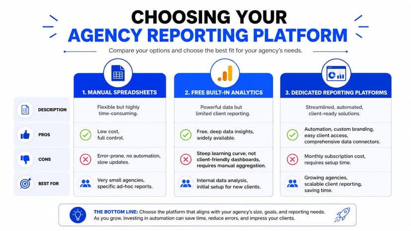
If you're weighing the category more broadly, this roundup of digital marketing reporting platforms is a useful starting point.
What to compare before you commit
Agencies should compare platforms based on how reporting works in practice, not just on feature grids.
Look closely at these points:
Multi-client management
Can your team switch between client accounts cleanly, reuse assets, and keep templates standardized?White-label depth
Basic logo swaps are one thing. Branded dashboards, custom domain delivery, and custom sender options are more important if client presentation matters to your retention model.Pricing model
Some platforms become awkward as your team grows because user seats stack up. Others are easier to plan around because pricing follows client count instead.Limits on reports and users
Agencies often need account managers, specialists, and leadership inside the same system. Hard limits create friction fast.Setup burden
A platform can look powerful in a demo and still create too much maintenance overhead once you're managing recurring reporting across many accounts.
A practical comparison
Here's the trade-off in plain terms:
| Option | Where it works | Where it struggles |
|---|---|---|
| Spreadsheets and slides | Small client loads, one-off reporting, custom presentations | Recurring reporting, consistency, error control, team scaling |
| Looker Studio | Flexible builds, teams comfortable with custom setup | Ongoing maintenance, template drift, client-friendly delivery |
| AgencyAnalytics / Whatagraph / Swydo | Dedicated client reporting workflows with agency-focused features | Fit depends on how much customization, white-labeling, and pricing flexibility your agency needs |
| Oviond | White-label client reporting for agencies, with pricing by client count, unlimited reports, dashboards, and users, plus custom domain options and AI or MCP-assisted setup | Still requires upfront template and workflow setup like any reporting platform |
That last point matters. No agency platform removes the need for clear reporting standards. The good ones just stop your team from rebuilding those standards every month.
AgencyAnalytics, Whatagraph, and Swydo all make sense for agencies that want a more packaged reporting workflow than Looker Studio typically provides. The main differences usually come down to how your agency prefers to handle branding, template reuse, pricing, and account scale. For teams that want all features in one plan, white-label delivery, unlimited internal users, and a client-count pricing model, that narrows the field.
The right choice is usually the platform your operations team can maintain across the full client base, not the one that looks most impressive in a sales walkthrough.
How to Build Your First Automated Dashboard
The first automated dashboard shouldn't be your most complex one. It should be the one that immediately removes friction from a reporting process your team already repeats every month.
Start with the core client stack
Pick one client type you serve often. A standard lead generation account is usually a good place to begin because the reporting pattern is familiar. Connect the main sources your team checks every cycle, such as GA4, Google Ads, Search Console, Meta Ads, or the CRM source that confirms lead activity.
Don't overcomplicate the first build. Use a template where possible, then trim it. Most agencies get better results from removing unnecessary widgets than from adding more.
If you're still evaluating whether to keep forcing a custom route through Google's ecosystem, this Looker Studio API automation guide is useful for understanding the setup and maintenance trade-offs behind a more technical approach.
Brand it before clients ever see it
Before you share anything, apply your white-label settings. That means agency branding, branded dashboards, and if your platform supports it, a custom domain and custom email sender. Clients notice presentation even when they don't mention it directly.
This is also the moment to lock in naming conventions. Use the same language your account managers use on calls. Rename charts so the dashboard reads like the service, not like the raw connector output.
A quick checklist helps:
- Use client-facing labels instead of internal shorthand
- Group widgets by service or funnel stage so the page reads naturally
- Add notes where context matters such as tracking updates, site changes, or campaign launches
Automate delivery and stop rebuilding reports
Once the dashboard is right, schedule delivery. That's where the operational gain really starts. The team stops assembling a fresh report packet every cycle and starts reviewing an always-current reporting system instead.
This walkthrough gives a clearer sense of what that looks like in practice:
The final step is process, not software. Decide who reviews the dashboard before it goes out, who owns client notes, and which template becomes the standard for similar accounts. Some teams also use AI-assisted setup or summary generation to speed up first drafts of dashboards and written insights. That can help, as long as someone on the account team still checks the story and the client context.
An automated website analytics dashboard works when it becomes part of delivery, not an extra layer sitting beside delivery. That's when reporting stops being a recurring headache and starts supporting retention, cleaner communication, and steadier growth.
If your agency wants a simpler way to handle white-label client reporting across a growing client list, Oviond is worth a look. It's built for agency workflows, with branded dashboards, automated delivery, custom domain options, multi-client reporting, and a pricing model based on client count rather than user seats.
Related articles
Simplify marketing reporting today
Stop juggling multiple tools. Start presenting clear, automated reports your clients will love