
Oviond Blog
How to Create Media Monitoring Reports Agencies Deliver
Discover expert tips for crafting media monitoring reports that impress clients and drive action. Learn key elements, best practices, and pitfalls to avoid.

The first week of the month always looks simple on the calendar. Then someone asks for the media monitoring report, and suddenly your team is pulling clips from news tools, exporting social mentions, checking broadcast transcripts, and fixing a spreadsheet that no longer matches the deck. The work isn't hard because the data is mysterious, it's hard because the data is scattered, the wording has to be clean, and the client wants a polished story, not a pile of raw mentions.
That's why media monitoring reports deserve their own workflow. This isn't a clipped-and-pasted appendix to a standard monthly recap. It's a reporting system that has to handle fragmented sources, repeated mentions, brand context, and white-label delivery, all without making your agency look like it built the whole thing at midnight.

The category is big enough to justify that level of discipline. Grand View Research pegs the media monitoring tools market at USD 5.46 billion in 2024 and projects USD 12.01 billion by 2030, which points to sustained double-digit expansion, while Mordor Intelligence gives a similar picture with USD 5.40 billion in 2025 and USD 10.09 billion by 2031 (Grand View Research). That's the kind of growth that tells agencies this is no longer a side task. It's a serious reporting function clients expect to be handled well.
Table of Contents
- Why Media Monitoring Reports Deserve a Dedicated Workflow
- Defining Goals and KPIs for Media Monitoring Reports
- Connecting Data Sources and Building Your First Dashboard
- Designing Reports for Decision-Making, Not Just Data Collection
- Automating White-Label Report Delivery for Scale
- Media Monitoring Reporting Checklist for Agencies
- Turning Media Monitoring Reports into Client Retention Tools
Why Media Monitoring Reports Deserve a Dedicated Workflow
Agencies that struggle with media monitoring usually have enough effort. What they lack is a process that can handle messy coverage, client questions, and the constant cleanup that comes with raw monitoring data. I've seen teams try to force this work into the same system they use for paid media or SEO reporting, and it breaks the first time a client asks whether a spike came from a campaign, a news cycle, or a duplicate article syndicated across half the web.
Fragmented coverage changes the job
Media monitoring is broader than articles alone. LexisNexis defines it as continually reading, watching, and listening to editorial content from print, online, and broadcast media to track coverage of an organization, people, brand, or competitors (LexisNexis glossary). That scope matters because audience behavior is spread across more places than a single clip folder can cover. Reuters Institute's 2025 Digital News Report shows six online networks now reach more than 10% weekly with news content, compared with just two a decade ago, and 36% of the global sample uses Facebook and 30% uses YouTube for news each week (Reuters Institute). Social video use also rose from 52% in 2020 to 65% in 2025, while any video moved from 67% to 75%. That makes the old “just track press clips” approach feel dated fast (Reuters Institute).
That fragmentation is where manual monthly reporting starts to eat time. You are not only gathering mentions, you are reconciling formats, filters, source types, and client expectations across channels. A clean workflow keeps your team from rebuilding the same report from scratch every month.
Practical rule: if a report can't survive duplicate clips, mixed source types, and a rushed client review, the process isn't ready yet.
The fix is a dedicated reporting path that starts with source selection, keeps the raw data auditable, and ends with a client-ready deliverable that looks consistent every time. For agencies that also need social coverage in the same view, a platform like Oviond's social media monitoring platform fits the broader workflow, because the job is consolidating reporting, not babysitting exports.
Defining Goals and KPIs for Media Monitoring Reports
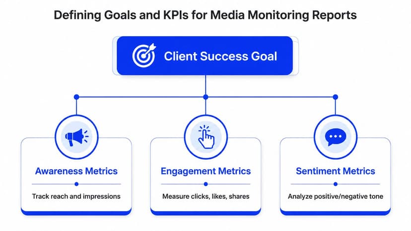
A monitoring report gets useful only after the team decides what the client needs to decide. If that part is fuzzy, the deck turns into a pile of clips, charts, and sentiment labels that look busy but do not help in a review meeting. Strong reports stay focused on a narrow goal, while still showing enough evidence to support the recommendation.
Start with the question, not the dashboard
The standard metrics are familiar for a reason. Industry guidance consistently points to volume of mentions, sentiment, reach or impressions, share of voice, and top outlets as the core building blocks of a monitoring report (Cision media monitoring guidance). Those measures work because they answer different questions. Volume shows how much attention the brand got, sentiment shows how that attention landed, share of voice shows where the brand sits relative to competitors, and top outlets show where the conversation came from.
The key decision is which of those deserves the most weight. A crisis client needs different emphasis than a campaign client. A regional brand may care more about outlet mix than broad impressions. The KPI set should match the decision the client is trying to make, not the data the tool happens to export.
Why baseline periods keep reporting honest
A baseline keeps you from reading every spike as a victory or a problem. Monitoring guides recommend pulling three to six months of coverage for higher-volume accounts, or up to a year for lower-volume ones, before judging change (PRCA APAC monitoring guide). That gives the report a reference point, which is what separates a trend from a random swing. It also helps the team explain whether a lift came from real momentum, seasonality, or a one-off burst that will fade before the next client call.
A baseline doesn't make the report fancier. It makes the conclusions defensible.
Human review still matters here. Automated sentiment is helpful, but it can miss sarcasm, unrelated contexts, and language noise, so any serious agency process should spot-check anomalies before a client sees them (PRCA APAC monitoring guide). I'd rather send a cleaner report with one less chart than hand over a confident-looking dashboard full of false precision.
For teams building a white-label workflow, the reporting layer also needs to stay consistent from one client to the next. Oviond's mention tracking update is relevant here because it fits the same operational problem, turning raw monitoring output into something clients can read without extra cleanup.
Connecting Data Sources and Building Your First Dashboard
The quality of the dashboard depends on what happened before the charting started. That's where a lot of agency reporting gets messy, because different team members export data in different formats, duplicate clips slip through, and the final deck gets built on numbers nobody fully trusts. Once that happens, every discussion becomes about the data hygiene instead of the client story.
Build the dataset before you build the visuals
A solid workflow follows four phases, recording and archiving, timing and coding, analysis, and reporting (Council of Europe monitoring toolkit). In practice, that means every mention should be logged on a structured form or datasheet with fields like outlet, issue, actor, length or space, location, and bias before anyone starts comparing channels. That coding layer matters because inconsistent tagging makes later comparisons unreliable.
For digital reporting, the practical move is to combine raw exports into one master dataset, remove duplicates, normalize metric names, and then calculate the KPIs. Duplicate articles syndicated across publishers, or repeated records from multiple tools, can inflate volume and distort competitive comparisons if they stay in the dataset. Once you've cleaned the source material, the dashboard finally becomes useful as a shared reference point instead of a debate starter.
Keep the dashboard answerable
A good dashboard doesn't try to show everything. It surfaces total mentions, sentiment distribution, geographic spread, platform breakdown, and share of voice in a layout a client can scan quickly. If a chart doesn't answer a client question, it's decoration. Agencies already know what decoration looks like, and clients usually ignore it.
Here's the discipline I've seen work: every chart should earn its place by tying to a specific decision. If the client can't act on it, it doesn't belong in the first view.

For teams building a cleaner system from scratch, Oviond's mention integration overview is a good example of how consolidation should feel, with one place to see recurring reporting instead of stitching together yet another one-off workbook.
Designing Reports for Decision-Making, Not Just Data Collection
A media monitoring report can look complete and still fail the client. The raw coverage is there, the charts are there, and the volume looks respectable, but the person reading it still has to figure out what matters, what changed, and what needs attention. That becomes a hidden cost for agencies. Someone on the team ends up translating data into client language after the report is already built.
Structure the report for how people read
The opening has to earn attention fast. A concise executive summary should state the main takeaway in plain language, then connect that takeaway to business relevance. After that, include the project description, the mission statement, the outlets monitored and why they were chosen, the methodology, and the key findings for the period. That mix gives clients enough context to trust the report without forcing them to hunt for the story.
The National Democratic Institute's monitoring guidance is blunt about this structure, recommending a brief description of the sponsoring organization and project, a summary of the mission statement, highlights of findings, the outlets monitored and why they were chosen, methodology, and detailed findings, along with graphs and charts showing both coverage volume and positive or negative assessments (NDI). The ACE Project adds another useful constraint, findings should be presented in neutral, politically non-partisan language, and conclusions must be backed by statistical data and other evidence (ACE Project). That advice travels well beyond election monitoring. Neutral writing keeps the report credible, and a clear structure keeps it usable when a client is scanning on a phone between meetings.
Treat weighting as judgment, not math theater
Not every mention deserves equal attention. Topic clustering, share of voice, and source weighting are directional tools, not absolute truth unless the source universe is clearly defined and consistent. That is why a polished report still needs editorial judgment. A high-volume source with weak relevance can distort perception if nobody checks the context.
The report should make it easy for a client to decide what matters next, not just what happened last month.
If the report ends with charts and no recommendations, it leaves the team doing the interpretation work twice. Busy clients want a readout that points toward next steps, not a recap they need to translate themselves. Practical recommendations can be paired with supporting context, and Oviond's guide on adding insights and media to complement report data is useful here because it shows how commentary, examples, and visual evidence can sit alongside the numbers without crowding them out. A report with recommendations becomes an account management tool rather than just a data product.
Automating White-Label Report Delivery for Scale
Once the reporting structure is stable, the bottleneck is delivery. Most agencies don't lose time in analysis, they lose it in file naming, version control, sending the right PDF to the right contact, and making sure the final result still looks like it came from the agency, not the software vendor. That busywork doesn't show up on a timesheet, but it absolutely shows up in burnout.
White-label delivery changes the client experience
If a report leaves your team with vendor branding, an awkward URL, or a mismatched sender name, the client experience feels stitched together. White-label delivery solves that by keeping the agency name front and center, with a branded domain, custom email sender, and consistent formatting across every report touchpoint. It's a small thing until you've managed enough accounts to know how often “small things” become the reason a client notices friction.
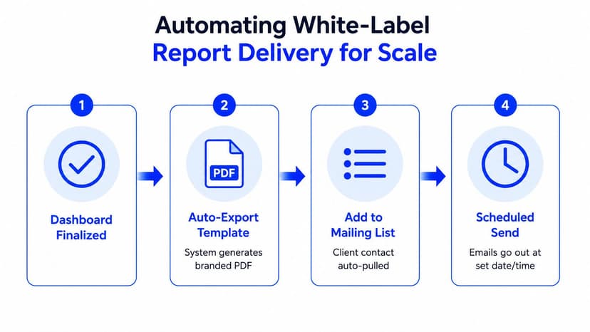
The case for automation is simple. When reports go out on a fixed schedule with live data refreshes, the team stops re-exporting the same material every month and starts working from a repeatable system. Template-driven setup also matters, because every new account shouldn't require a rebuild. Reusable report structures, prebuilt components, and calculated metrics make the whole process less fragile.
Why one-off reporting collapses under growth
The moment you have more than a handful of clients, manual delivery creates hidden labor in every direction. Someone has to check the file, another person has to send it, and someone else has to answer the “can you resend that?” email when the attachment is outdated. Multiply that across recurring reporting cycles, and the process becomes the reason the agency can't take on more work without adding headcount.
Oviond's white-label reporting approach is built around that exact pressure, with automation, custom email senders, multiple custom domains per account, and setup that doesn't force you into per-seat friction. Its pricing also scales by client count, with all features in one plan and unlimited reports, dashboards, and users, which is the kind of structure agencies tend to appreciate once reporting starts growing faster than the team. For a deeper look at the delivery side, Oviond's white-label reporting guide shows how branded delivery fits into the broader process.
A scheduled report should feel boring in the best way. It shows up on time, looks right, and doesn't need a rescue mission from your team.
Here's a quick visual on what that automated handoff should look like in practice.
Media Monitoring Reporting Checklist for Agencies
The fastest way to lose trust is to send a report with a clean-looking chart and a dirty back end. I've seen sentiment spikes caused by duplicate mentions, executive summaries that used jargon nobody in the room wanted to decode, and client links that still showed the vendor's branding in the browser tab. None of that is complicated. It just means nobody checked the final mile.
Run the same checks every time
Before the report goes out, confirm the data refreshed correctly and that the reporting period has no gaps. Verify the baseline comparison is correct, especially when the client has an unusual campaign cycle or a low-volume brand profile. Then check duplicate mentions across syndicated publishers and spot-check sentiment scores where the automation flagged anything odd.
- Data freshness: Confirm every source refreshed and no sections are missing coverage.
- Baseline accuracy: Make sure the comparison window matches the client's expected context.
- Duplicate removal: Check syndicated or repeated mentions before totals go to the client.
- Sentiment review: Manually inspect anomalies, sarcasm, and context-heavy mentions.
- Executive summary: Keep the key finding plain, direct, and easy to repeat in a meeting.
- Chart labeling: Add time period, data source, and methodology caveats to every chart.
- White-label settings: Verify the custom domain, branded sender, logo, and client colors.
- Link testing: Open the report in an incognito window and confirm the client view is clean.
- Metric accuracy: Check calculated metrics and goal targets before scheduling delivery.
- Recommendations: Pair every insight with a next step the client can use.
That's the checklist I'd rather have an account manager follow than a pile of “final final” versions in a shared folder. It's quick, it's repeatable, and it prevents the kind of mistakes that look small internally but feel sloppy to a client.
Turning Media Monitoring Reports into Client Retention Tools
The strongest reports do more than inform. They make the agency feel organized, consistent, and worth keeping. When the same structure shows up every month, the data is clean, and the branding is on point, the report stops being a deliverable and starts acting like evidence that the agency has its act together.
That matters because clients don't only judge the insight. They judge the experience of receiving it. A report that lands on schedule, in the right format, with the right context, tells the client that the agency can handle complexity without turning it into chaos. That's retention work, even if nobody labels it that way.
A solid reporting system also protects the team behind it. Once the workflow is standardized, the agency isn't rebuilding the same deck for every account or worrying whether the next client report will expose a formatting mistake. The process becomes easier to run, easier to scale, and easier to trust.
If your media monitoring reporting still depends on manual exports, spreadsheet cleanup, and too many late-night fixes, it's time to replace the scramble with a cleaner system. Visit Oviond to see how white-label client reporting, branded dashboards, and automated delivery can make agency reporting that finally feels simple.
Related articles
Simplify marketing reporting today
Stop juggling multiple tools. Start presenting clear, automated reports your clients will love