Feature

Custom metrics and data queries

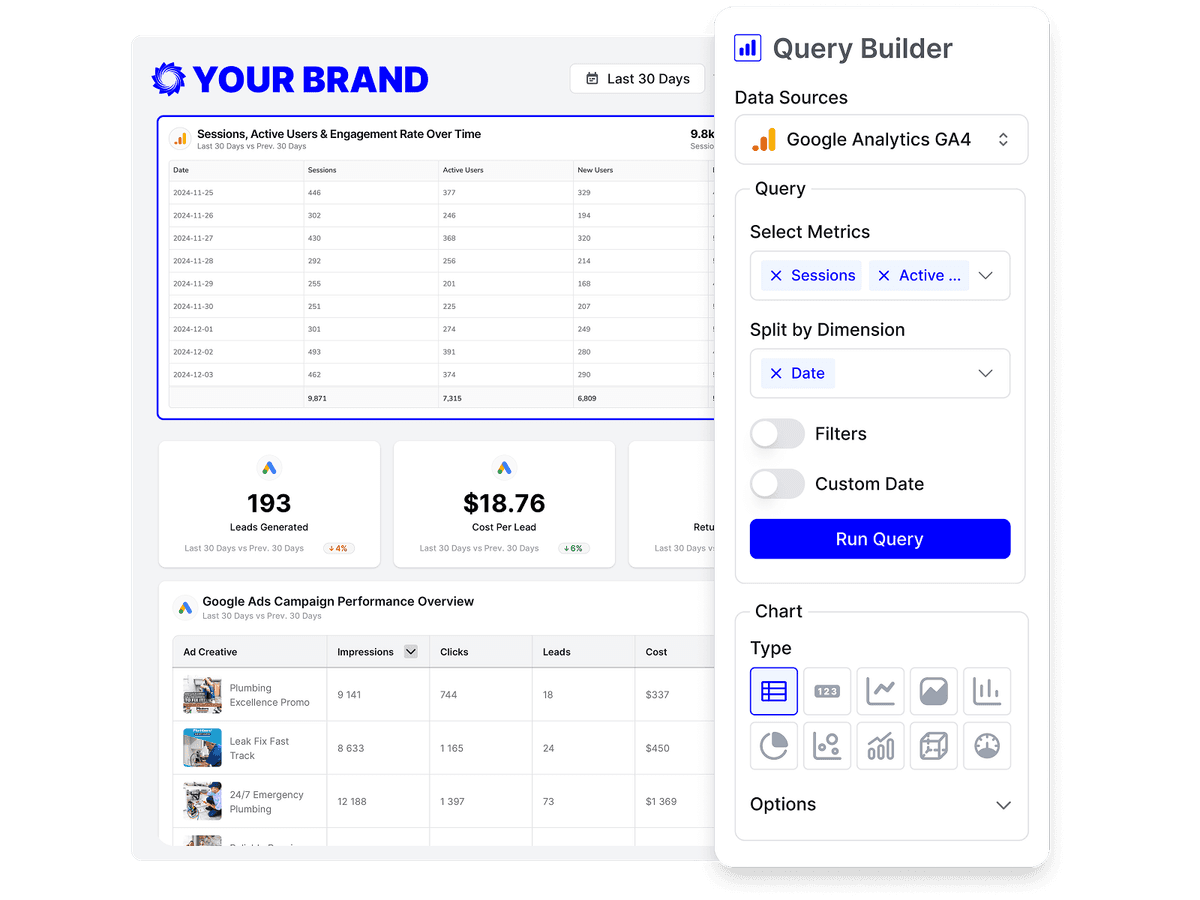
A data widget in Oviond is a query you build by hand: pick the source, metric, and dimension, then filter, compare, and format it so the report answers the question that client keeps asking.

Oviond's query builder configuring a data widget — choosing a data source, metrics, a split dimension, filters, a date range, and a chart type.

Why custom metrics and queries

No two clients ask for the same numbers

A reporting tool with a fixed KPI list eventually says no. This one hands you the field catalog.

The metrics that client cares about

Choose from a source's full catalog of metrics and dimensions rather than a shortlist, and split any figure by the breakdown that makes it useful.

Ten ways to show it

Move between tables, scorecards, and line, bar, column, area, pie, donut, funnel, and map charts without touching the query underneath.

Metrics you define yourself

Define KPIs from formulas, track targets with a gauge, and upload your own dataset when a number lives outside every connected platform.

How it works

How a data widget gets built

Every chart and KPI in Oviond resolves to the same query: one data source, one data view, the metrics you picked, and an optional dimension to break them down by. Only sources linked to that client are selectable, so a widget can never reach data it shouldn't.

Metrics and dimensions come from each platform's own field catalog, which means the options you see are the ones that source genuinely supports for that view — not a lowest-common-denominator list.

Source, view, metric, dimension

Pick a connected source, the metric you want to measure, and an optional dimension to split it by — campaign, day, country. Fields a provider has retired stay selectable but are flagged so you can choose a current equivalent.
Ten chart types

Table, scorecard, area, line, bar, column, pie, donut, funnel, and map. Switch between them and the data configuration stays exactly as you set it.

Filters

Narrow a widget with equals, not equals, contains, does not contain, starts with, ends with, and greater or less than comparisons, combined with and/or logic.

Period comparisons

Show the previous period's value, the percentage change, or both on tables and on line, area, and bar charts. Any widget can also override the report's date range — useful for a year-over-year tile.

Metric formatting

Rename a metric, format it as a number, decimal, percentage, currency, or duration, and set whether a rise is good or bad — so a falling cost per lead reads as a win instead of a red arrow.

Formulas, targets, and your own files

Define a KPI from a formula such as revenue divided by sessions, measure progress against a target with a gauge, or upload a CSV or JSON dataset of up to 10,000 rows for figures no platform holds.

The 'can you also add this' request

Three answers that stop being no.

A fixed KPI list you can't extend

Any metric and dimension the platform exposes.

Exporting to a spreadsheet to do the math

Calculated metrics defined once, charted like any other.

Cost metrics turning green when they rise

A per-metric indicator, so falling costs read as wins.

Where the query ends up

Choosing the numbers is one step. These three are what happens to them next.

Put the query on a page

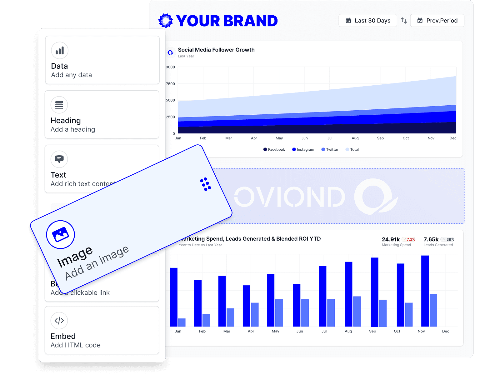
Drag the widget onto the grid, size it, title it, and surround it with the headings and commentary that explain what the client is looking at.

Drag-and-drop report builder in Oviond, adding data, headings, text, images, and embeds to a branded marketing report.

Recalculated on every send

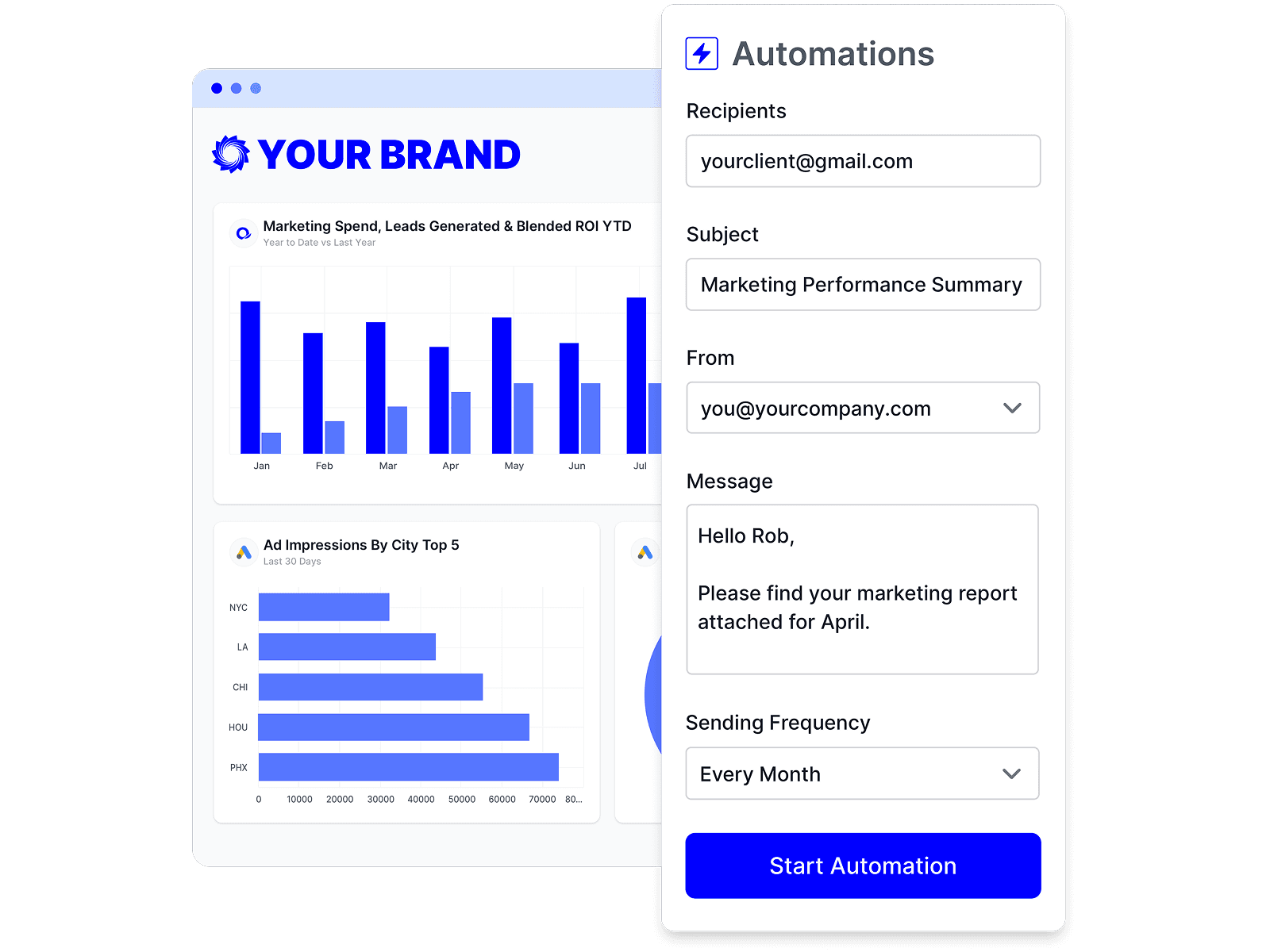
Scheduled reports re-render before they go out, so filters, comparisons, calculated metrics, and goals are all recomputed for the new period.

Automated report delivery in Oviond, scheduling a Marketing Performance Summary email to clients on a monthly sending frequency.

Discover the same fields over the API

One call describes a source's data views, metrics, and dimensions, so an AI assistant or a script configures widgets from the real catalog instead of guessing field names.

Oviond connected to AI assistants like Claude and ChatGPT through its MCP server to pull client data and build marketing reports.

Every field, from every source

Each of the 70+ marketing data sources Oviond connects publishes its own metrics and dimensions, and the widget builder reads that catalog directly.

Custom metrics and query FAQs

Fields, filters, formulas, targets, and your own data — what a widget can be told to do.

What is a data query in Oviond?

A data query is the configuration behind a widget: the connected data source, the data view, the metrics you selected, an optional dimension to break them down by, and any filters. Every chart, table, and KPI in a report is one of these.

Which metrics and dimensions can I use?

Whatever the source publishes. Each platform exposes its own catalog of metrics and dimensions grouped by data view, and a field is valid inside its own view. Fields the provider has retired remain selectable so existing widgets keep working, but they are flagged so you can pick a current equivalent for anything new.

Can I create my own metrics?

Yes. A calculated metric is a formula that combines metrics from your connected sources with operators and constants — revenue divided by sessions, or clicks divided by impressions as a percentage. Once saved it appears in the metric picker alongside the source's own fields.

Can I compare against the previous period?

Yes. With a comparison period active you can show the previous value, the percentage change, or both. Tables and line, area, and bar charts render side-by-side comparisons; pie, funnel, map, and scorecard widgets do not, so the option is hidden for them.

Can I filter a widget?

Yes. Filters take a field, an operator, and a value — equals, not equals, contains, does not contain, starts with, ends with, and the greater or less than comparisons — and several filters can be combined with and/or logic.

Can one widget use a different date range from the report?

Yes. Every widget inherits the report-level date range by default and can override it, which is how you put a year-over-year tile next to a current-month chart on the same page.

How do I make cost metrics read correctly?

Set the metric's comparison indicator to lower is better. Cost, cost per click, and bounce rate then show green when they fall and red when they rise. The arrow and the sign always follow the real movement — only the color changes.

Can I report on data that isn't in a connected platform?

Yes. Upload a CSV or JSON file as a custom dataset — offline sales, a lead list, a forecast — and map its columns to a widget's metrics and dimensions. Datasets are account-level, so any client's report can use one, and each holds up to 10,000 rows.

Can I set targets and show progress towards them?

Yes. A goal pairs a metric query with a target value and an operator — at or above, equal to, or at or below — and renders as a gauge. Static goals measure the metric against a fixed target; change goals measure the movement over the period.

Where to go next

Queries decide what the report says. See marketing reporting for the recurring deliverable and marketing dashboards for the live view, white-label reporting for how it is styled, and client report sharing for how it reaches the client. Coming from another tool? See all comparisons.

Report the numbers that actually matter

Build the query, format the figure, and give each client the KPI they keep asking about.