
Oviond Blog
Client Reporting Tool: Agency Guide to Smarter Dashboards
Find the right client reporting tool for your agency. Learn core features, automation tips, and branded dashboard delivery.

If you're still stitching together Google Ads, GA4, Meta, LinkedIn, Search Console, and a CRM in separate tabs every month, you already know the problem isn't reporting, it's the scramble around reporting. The deck itself is only the last mile. What burns the team out is the export chasing, the formula drift, the brand reformatting, and the moment someone asks for a “quick update” because the Looker Studio chart broke again.
That's why the client reporting tool category exists. For most agencies, the reporting stack isn't one source, it's 3–8 data source connections per client, usually across GA4, Google Ads, Search Console, one or two social ad platforms, email, and sometimes a CRM, which is exactly why spreadsheet reporting turns into version chaos so fast (Basedash industry comparison). A modern platform doesn't just make charts look cleaner. It gives you a repeatable, branded delivery system that can pull data together, standardize it, and ship it without the monthly copy-paste ritual.
Table of Contents
- Why Agencies Are Ditching Spreadsheets and Looker Studio
- How a Client Reporting Tool Actually Works
- Core Features Every Agency Should Demand
- Setting Up Your First Automated Client Report
- Live Dashboards Versus Scheduled Reports
- Choosing a Pricing Model That Scales With Your Agency
- Why Oviond Fits the Agency Workflow
Why Agencies Are Ditching Spreadsheets and Looker Studio
The monthly reporting scramble usually starts the same way. Someone exports CSVs from Google Ads, pulls GA4 and Search Console data, checks Meta and LinkedIn, pastes everything into a sheet, then spends more time fixing formulas and reworking brand colors for each client. If one connector breaks or a report link stops loading, the whole chain gets pushed back into the queue.
Spreadsheets and brittle dashboard builds are fine for a one-off analysis. They break down fast as an operating system for recurring client reporting. The cost is not just time. It is the hidden admin around version chasing, inconsistent KPI definitions, and the constant question of which file is current.
A team should be able to answer the same metric the same way every time. If that is not happening, the reporting workflow is the problem, not the metric.
A proper client reporting tool replaces that mess with one automated flow. It centralizes channel data, applies the same logic every time, and delivers it in a branded format clients can recognize. In agency terms, that means fewer spreadsheet edits, fewer broken links, and fewer “can you resend the latest version?” messages.
The hidden cost gets bigger as client count grows. Agencies are not just dealing with more reports, they are dealing with data normalization, brand-by-brand formatting, and the admin of keeping every client workspace aligned. A single-plan platform avoids the seat-by-seat bill shock that comes with tools priced around individual users, and it reduces the version drift that happens when one person updates a spreadsheet while another is still working from last week's export. Basedash industry comparison
A white-label setup matters for the same reason. It gives the team one place to standardize data, one place to control presentation, and one delivery system that does not depend on whoever last touched the sheet. For agencies comparing Looker Studio replacements, this overview is worth reading.
How a Client Reporting Tool Actually Works
A reporting platform breaks down into three parts: intake, cleanup, and delivery. Connectors pull raw data from ad platforms, analytics tools, CRMs, email systems, and ecommerce sources. The transformation layer cleans, blends, and normalizes that data so the same metric means the same thing across channels. The delivery engine then pushes governed data into live dashboards or scheduled reports.
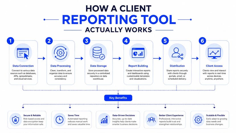
Connector depth still matters, but only if the rest of the pipeline can handle the data. Adverity industry guidance notes that modern tools often support 50+ to 250+ integrations, and stronger platforms pair prebuilt connectors with custom connector options when a source is missing. That reduces manual CSV exports, and it lowers the risk of data drift when Google Ads, GA4, CRM, and ecommerce systems do not line up cleanly.
The part many teams underbuild is standardization. Agencies need to normalize currencies, align KPI definitions, and standardize transformations before dashboards are trustworthy. Without that layer, automated reports only make inconsistent data look polished, which is exactly the trap Funnel coverage points to in its reporting guidance.
A dashboard is only as reliable as the definitions behind it.
The strongest platforms treat reporting as a pipeline, not a page. If the data model stays stable, the output can stay flexible. That is what turns a reporting tool into part of the agency ops stack instead of another pretty front end. For teams that want a more structured marketing reporting workflow, this guide to reporting software is useful.
Core Features Every Agency Should Demand
The must-have list is smaller than most vendors make it sound, but it's stricter. Agencies need multi-source integrations, automated scheduling, white-label branding, customizable dashboards, permission controls, and data blending so spend, leads, revenue, and attribution can sit in one view (Fanruan agency review). Anything else is decoration if those basics aren't solid.
What to verify before you sign
| Feature | Pain It Solves | What to Verify |
|---|---|---|
| Multi-source integrations | Stops manual CSV exports and tool switching | Minimum support for GA4, Google Ads, Meta, LinkedIn, Search Console, and your client's CRM or ecommerce stack |
| Automated scheduling | Ends the monthly report scramble | Can reports publish on a fixed cadence without manual touchpoints? |
| White-label branding | Prevents vendor-branded delivery from weakening your agency's presentation | Custom logos, colors, domains, and email sender control |
| Data blending | Makes cross-channel performance usable | Can it combine spend, leads, revenue, and attribution in one reporting view? |
| Permission controls | Keeps teams and clients in the right lanes | Role-based access, client-level visibility, and safe collaboration |
| Unlimited growth | Prevents hidden scaling costs | No per-seat or per-dashboard penalty as client count rises |
The feature list matters because some tools look modern but still punish growth. Per-seat pricing sounds harmless until you add account managers, strategists, and client-success people, then the reporting system starts charging you for the size of your own team. That's a bad fit for agencies that grow by adding clients and collaborators, not by squeezing more work out of the same two people.
There's also a difference between always-current and useful. Live dashboards are great for active monitoring, but they're not automatically better for every client or every meeting. If the vendor can't control access, curate views, and blend data cleanly, the dashboard just becomes a noisier version of the old spreadsheet.
I'd also watch for white-label depth. A custom logo alone isn't enough if the email sender, domain, and client-facing URLs still feel half-branded. Agencies don't need more dashboard toys, they need delivery that looks like it came from their own team. For a practical checklist around KPI presentation, this dashboard guide helps frame the right questions.
Setting Up Your First Automated Client Report
The fastest path to a report your team can use is to start from a template, not a blank page. Pick a Digital Marketing, PPC, or E-commerce template, connect the client's data sources, define the calculations and goals that matter, then apply the white-label styling, set the custom domain and sender, and schedule delivery.
Templates are not about making every client look identical. They give your team a stable structure that can be reused without rebuilding each layout from scratch. Once the skeleton is in place, the work becomes deciding what each client should see, and what should stay out of the report.
A reusable setup usually has four parts:
- Connect the core sources: Start with the platforms that hold the client's main spend and outcome data.
- Set calculated metrics: Define the numbers you want the team to trust, not just the ones each platform exports by default.
- Apply the brand layer: Add the logo, colors, sender, and domain so the report looks native to the agency.
- Schedule and clone: Save the report, then duplicate the configuration across similar clients instead of rebuilding it each time.
Reusable assets matter because they remove repeated setup work. Saved queries, branded templates, and goal configurations cut the burden on the second, third, and tenth client because the structure is already decided. That is the operational difference between a reporting system and a folder full of one-off dashboards.
The category has matured quickly. Purpose-built platforms now offer 80+ native integrations, which shows how far agency reporting has moved beyond the old PDF-generator model (Basedash industry comparison). If your team is short on bandwidth, AI or MCP-assisted setup can also help generate the first dashboard from a prompt, which lowers the barrier for teams that do not have a data engineer on standby.
Live Dashboards Versus Scheduled Reports
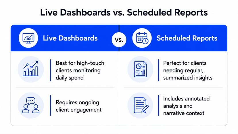
A lot of vendors push live dashboards as the default answer, but that's too simplistic. Dashboards are useful for clients who watch spend closely, especially during active campaigns, launches, or performance swings. They're less useful when the client wants a clean monthly story with context, not another place to click around.
Practical rule: use live views for monitoring, use scheduled reports for decisions.
The best agencies separate audience from cadence. A CMO might get a live KPI view for quick checks, while a finance stakeholder gets a scheduled PDF that emphasizes budget pacing, variance, and the next action. The format should follow the decision moment, not the platform's favorite feature.
Dashboards also create a subtle management problem. They can improve freshness, yet they can also create more stakeholder noise and less narrative clarity if teams don't curate what clients should watch between meetings (Teamwork coverage). That's the part most pitch decks skip. More access doesn't automatically mean better decisions.
Scheduled reports still matter because they force a narrative. They're fixed, auditable, and easier to annotate, which is useful when you need to explain why a metric moved and what you're doing about it. If the client's job is to review strategy, a curated report often beats an always-open dashboard.
There's also a pricing angle here. Agencies that buy per-seat tools can end up paying more as the team adds reviewers, analysts, or account managers. A client-count model avoids that penalty, which is why many ops leads prefer tools that price around delivery volume rather than headcount. The reporting format and the billing model should both scale with the agency's actual workflow.
If you want a direct comparison of dashboards and report delivery, this breakdown is a helpful reference.
Choosing a Pricing Model That Scales With Your Agency
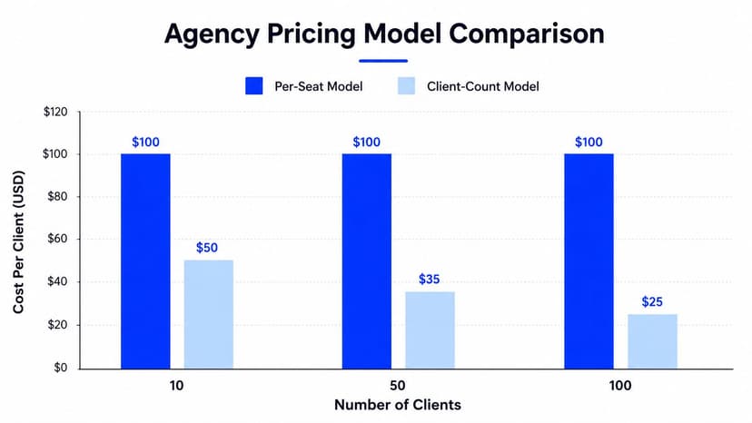
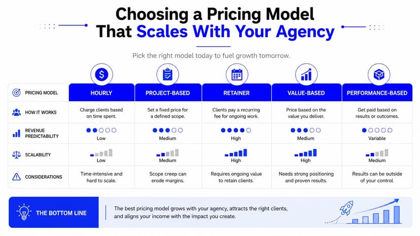
Agency pricing gets messy fast when vendors charge for people instead of output. Per-seat pricing can look inexpensive at the start, then turn into a penalty every time you add an account manager, strategist, or client-success lead. For agencies, that's a poor fit. Collaboration is part of the work, not an extra.
A client-count model fits better when reporting volume grows faster than headcount. It also matches how agencies sell and deliver service, since the reporting workload usually expands with each client account, not with each login. If a platform includes unlimited reports, dashboards, and users in one plan, the budget is easier to forecast and harder to distort with feature walls.
The real savings go beyond software fees. They show up in support time, setup time, and migration time. If the vendor helps move existing reports over and does not charge more because more people need access, the operational cost stays lower than the sticker price suggests. That matters when teams are already spending too much time normalizing data, checking version changes, and keeping clients on the right report.
Oviond fits that model with a single-plan approach, pricing by client count, unlimited reports, dashboards, and users, plus human support and migration assistance from the smallest plan. It starts at $40/month for 10 clients and scales with the number of clients rather than the number of seats. Oviond pricing follows the same logic. That structure is easier to explain to an agency owner who is tired of watching tool costs rise faster than the client base.
Why Oviond Fits the Agency Workflow
An agency can have the reporting process mostly figured out and still lose hours every month to the parts no client ever sees, normalizing data from different sources, reworking branded dashboards, and chasing the latest version before a send goes out. Oviond is built around that reality. It supports 70+ integrations, white-label delivery with custom domains and custom email senders, template-driven setup, automated delivery, and AI or MCP-assisted creation, so the workflow does not depend on spreadsheets or fragile one-off builds.
The bigger issue is operational, not cosmetic. Agencies do not need another BI project. They need a client reporting system that can handle recurring updates, branded dashboards, and team collaboration without per-seat fees. Oviond's single-plan model, unlimited usage, and client-count pricing fit that workflow better than tools that charge every time access expands.
That matters because reporting work rarely stays inside one person's inbox. When account managers, analysts, and leadership all need the same dashboard, extra seat fees and permission work can turn a simple reporting stack into a mess of hidden costs. A single-plan setup cuts down on that friction and makes the monthly process easier to repeat.
It is also already being used in the market, with adoption referenced at 3,000+ agencies. That does not make the tool right for every shop, but it does show the category moving toward agency-native delivery instead of generic dashboard hosting. If your team is trying to get out of spreadsheet chaos and into something more repeatable, Oviond is worth a look.
If your agency is still rebuilding the same monthly report by hand, reporting is acting like admin work instead of a client deliverable. Oviond gives agencies branded dashboards, scheduled delivery, and a client-count pricing model that scales with the work, not the headcount. Start there if you want agency reporting that feels easier to run.
Related articles
Simplify marketing reporting today
Stop juggling multiple tools. Start presenting clear, automated reports your clients will love