Oviond Blog
Marketing KPI Dashboard: How Agencies Build and Deliver
Build a marketing KPI dashboard that scales across clients. A practical agency guide to defining metrics, mapping data, automating delivery, and white-labeling.

Monday morning starts the same way for a lot of agencies. Someone's in Slack asking for the latest numbers, an account manager is opening the wrong spreadsheet, and the client wants to know why last month's report looks different from the one in the meeting deck. The work isn't hard because the data is mysterious. It's hard because the reporting lives everywhere except one place.
A marketing KPI dashboard fixes that when it's built for decisions, not decoration. For agencies, that means one branded view that pulls client data together, updates automatically, and shows the numbers that connect marketing activity to pipeline and revenue. When reporting works like that, it stops being a monthly fire drill and starts feeling like a product your agency can deliver again and again.
Table of Contents
- What a Marketing KPI Dashboard Does for an Agency
- Defining Objectives and Choosing KPIs That Change Decisions
- Mapping Data Sources and Building Calculated Metrics
- Choosing Visualizations by KPI and Audience
- Building the Dashboard with Templates and Reusable Assets
- Scheduling, Automation, and White-Label Delivery
- How Oviond Compares to Other Agency Reporting Tools
What a Marketing KPI Dashboard Does for an Agency
Monday morning starts the same way for a lot of agencies. Someone's in Slack asking for the latest numbers, an account manager is opening the wrong spreadsheet, and the client wants to know why last month's report looks different from the one in the meeting deck. That is usually the point where the reporting model, not the dashboard layout, is the part that needs fixing.

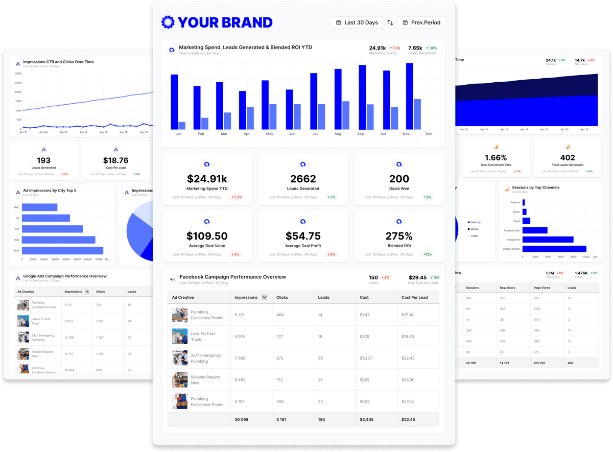
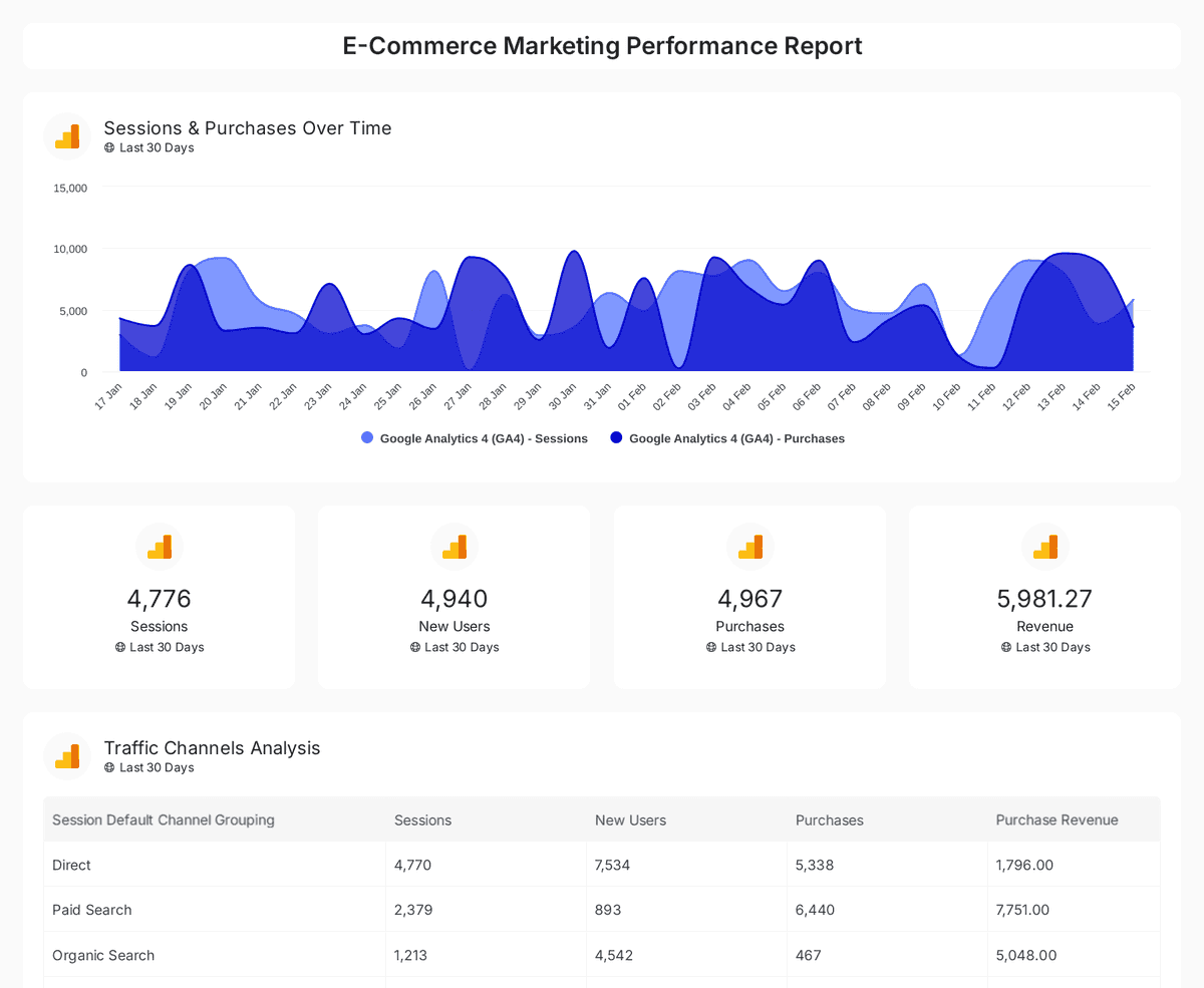
A marketing KPI dashboard gives an agency one screen for the numbers that connect marketing work to business outcomes. The useful metrics are the ones that show whether spend, targeting, landing pages, or follow-up need attention, with core metrics often including conversion rate, cost per lead, customer acquisition cost, marketing qualified leads, return on marketing investment, click-through rate, and customer lifetime value. In practice, teams also keep an eye on operating ranges such as paid-search conversion rates of 2% to 5%, paid-search CTR of 2% to 5%, display CTR of 0.5% to 1.5%, and a 3:1 LTV:CAC target as a healthy acquisition benchmark, because those reference points make the dashboard useful instead of decorative. That approach lines up with the purpose of dashboards in digital marketing and with practitioner guidance on dashboard KPIs and benchmarks, which focuses on tying channel performance to business outcomes and keeping the view updated from analytics, ads, CRM, and email systems. KPI marketing dashboard definition and benchmark guidance
Why agencies feel the pain faster than in-house teams
An in-house marketer usually reports on one business with one approval chain. An agency has to do that across many clients, often with different goals, different sources, and different delivery formats. Monthly PDFs and copied spreadsheet tabs start breaking down fast in that setup.
A dashboard changes the job from rebuilding the report to maintaining the reporting system. It gives account managers, ops leads, and clients the same current view, with white-label delivery layered on top so the agency's brand stays in front. That matters because agencies are not just showing data, they are also selling confidence, consistency, and a repeatable client experience.
Practical rule: if a metric cannot change a decision, it belongs in a drill-down, not on the front page.
Cadence is the other difference. Agencies do not need every client on the same refresh pattern, but they do need every client to stop living in stale exports. Live dashboards and scheduled delivery work better than static reports when the same story has to be repeated across 5, 10, or 50 clients. The best agency setup treats reporting like an operational service, not a slide deck.
Defining Objectives and Choosing KPIs That Change Decisions
A dashboard gets messy fast when the team starts with charts instead of the client's goal. A better workflow starts with the business outcome, then works backward to the few KPIs that would change what the team does next. A technically sound marketing KPI dashboard should define the decision first, then choose the KPIs that move that decision, then map each KPI to a source system, and only then place the most important metrics at the top of the screen.
Start with the goal, not the metric list
A DTC e-commerce brand usually starts with revenue efficiency, so CAC, LTV, and channel-level return matter more than engagement fluff. A B2B SaaS client usually needs MQLs, lead-to-opportunity movement, and pipeline contribution near the top. A local services client often cares more about cost per lead, call or form conversion, and booked appointments than broad traffic trends.
For agencies, the useful part is the decision tree. The goal is a repeatable decision tree, not a one-size-fits-all KPI set. If a metric will not change the next budget conversation, campaign pause, or landing page fix, it should stay out of the main view.
Build the dashboard around what the client will ask in the meeting.
That question usually exposes the problem fast. If the answer is “nothing,” the metric belongs in a drill-down, not on the front page.
What to keep off the main screen
A lot of agencies overload the front page with every measurable thing because no one wants to be the person who left something out. That is how dashboards get ignored. Keep the main view focused on a small set of decision metrics, and move the rest into secondary tabs or drill-down sections.
A sensible split looks like this:
- Revenue metrics: CAC, LTV, ROAS, and return on marketing investment.
- Acquisition metrics: CPL, conversion rate, and MQL volume.
- Engagement metrics: CTR, email engagement, and page behavior trends.
- Efficiency metrics: spend pacing, budget variance, and acquisition efficiency.
That structure gives account managers something concrete to defend in kickoff meetings. It also makes client reviews cleaner, because the dashboard answers a business question instead of listing everything the platform can measure. For a broader metric inventory and category breakdown, the agency-friendly reference What Are Marketing KPIs is a useful companion.
Mapping Data Sources and Building Calculated Metrics
A lot of agency reporting falls apart at the source level. The KPI list looks solid on paper, then the team realizes half the numbers live in ad platforms, the rest live in CRM, and nobody agreed on which source owns the truth. Source mapping matters just as much as KPI selection.
Match each source to a job
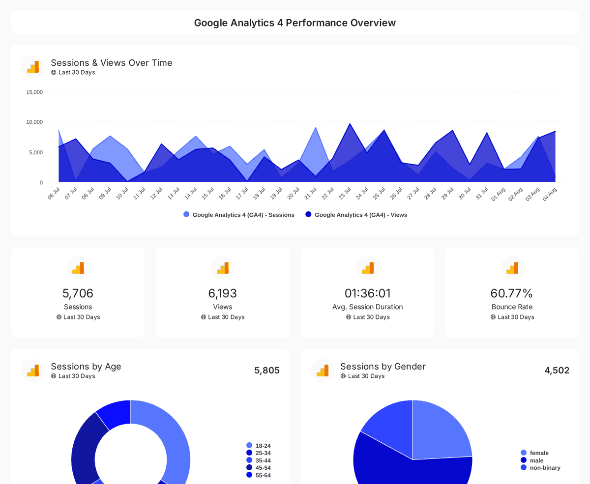
Each platform should feed a specific part of the story. GA4 usually handles behavior and onsite conversion, ad platforms handle spend and campaign performance, email tools handle delivery and engagement, and CRM handles pipeline and revenue. E-commerce platforms fill in order and revenue context when the client sells online.
| Source | Primary KPI Category | Typical Use |
|---|---|---|
| GA4 | Behavior, conversion | Landing page performance, site flow, conversion actions |
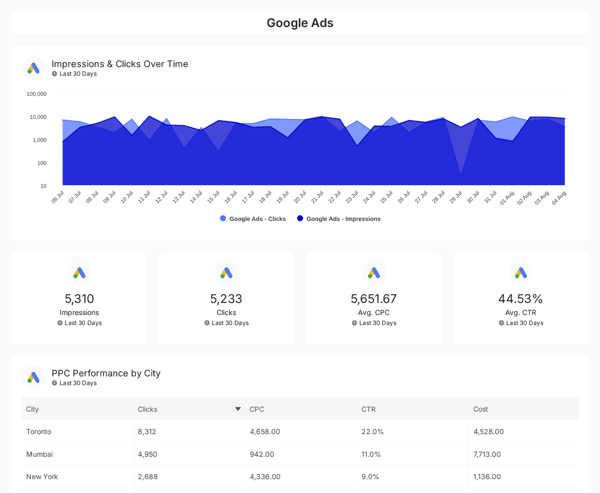
| Google Ads | Acquisition, efficiency | Spend, click-through performance, paid search conversion |
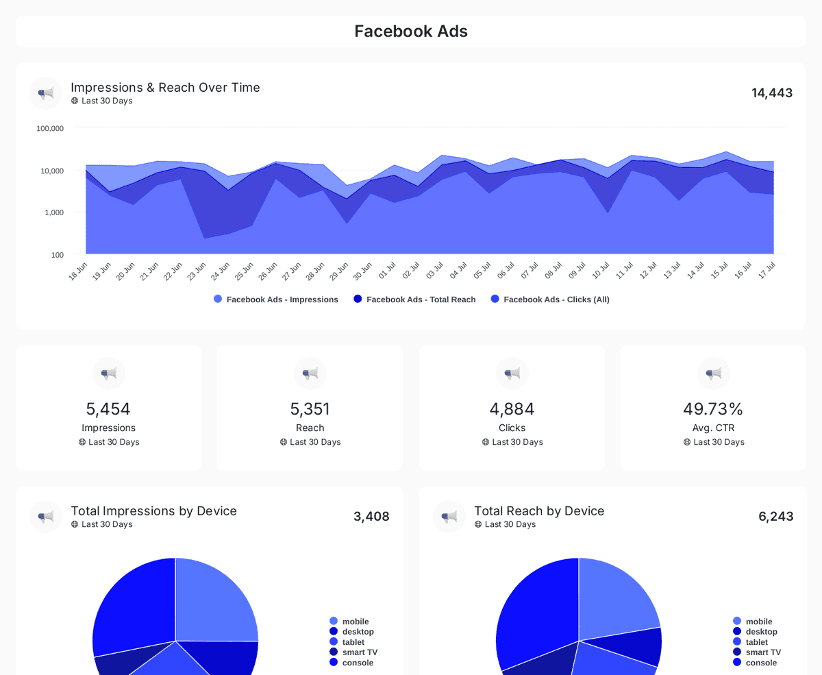
| Meta Ads | Acquisition, efficiency | Paid social spend, clicks, lead volume |
| LinkedIn Ads | Acquisition, pipeline | B2B lead generation and audience targeting |
| Microsoft Ads | Acquisition, efficiency | Search spend and paid-search comparisons |
| Google Search Console | Search visibility | Search clicks, query performance, organic opportunity |
| Mailchimp | Email engagement | Deliverability, opens, clicks, list engagement |
| CRM | Pipeline, revenue | MQLs, opportunities, closed revenue |
| E-commerce platform | Revenue, conversion | Orders, average order value, purchase behavior |
A reporting tool should connect those sources and then calculate the numbers that do not arrive prebuilt. That can mean blending channels into one acquisition view, creating custom math for ratios, or defining goals on the metrics the client cares about. The useful version is straightforward and practical. You want the tool to do the math once so the agency does not keep rebuilding it in spreadsheets for every client report.
Watch the integration traps
Most reporting problems at this stage come from three places. First, mismatched date ranges make one channel look stronger or weaker than it is. Second, attribution models differ by platform, so a number in Google Ads will not always match a number in CRM. Third, multi-region clients can create currency headaches if the dashboard does not handle them consistently.
Keep the rule simple. If two sources disagree, do not hide the difference. Label the source logic, standardize the calculation where you can, and keep the metric definition stable so the client sees the same story every time. For a closer look at reporting workflow and measurement choices, the agency guide on data and measurement covers that side of the job well.
Choosing Visualizations by KPI and Audience
A dashboard can be technically correct and still feel useless if the charts make the story hard to read. Agencies don't need more chart variety. They need chart choices that match the metric and the person reading it. The same data that helps an account manager react on Tuesday morning can overwhelm a client CEO in a weekly summary.

Pick the chart that matches the decision
For spend over time, trend lines usually beat stacked bars because the eye reads direction faster than composition. If the question is whether budget is rising, falling, or flattening, a line chart answers it without clutter. That's especially useful for client check-ins where pacing matters more than decoration.
For a performance snapshot, a single number with a sparkline is usually clearer than a pie chart. The number tells you where you are now, and the tiny line shows whether it's moving the right way. Pie charts don't help much when the question is “good, bad, or off-track?”
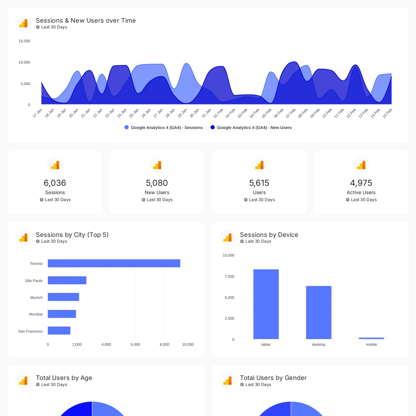
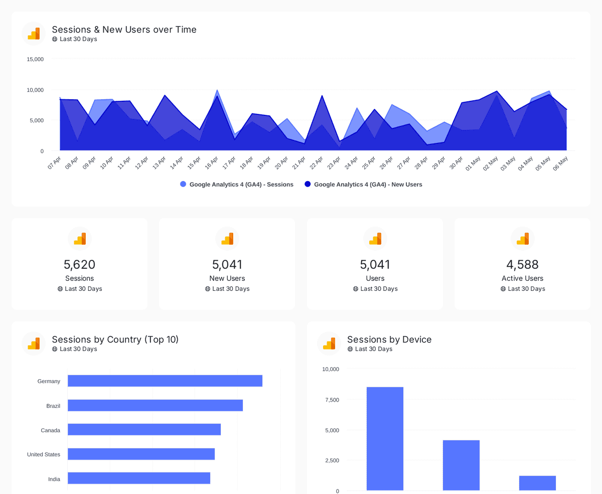
For campaign comparison, bar charts still earn their spot. They make it easy to compare discrete items like campaigns, ad groups, landing pages, or client locations. Tables also belong in the mix when account managers need to inspect campaign-level detail, because clients often want to know which line item drove the result, not just the headline number.
Separate the account manager view from the client view
The account manager usually needs more diagnostic detail. That means active campaigns, pacing, segment breakdowns, and the numbers that explain what to fix next. The client CEO wants the cleaner version, the one that shows movement, progress, and whether the agency is steering in the right direction.
That doesn't require separate reporting systems. It just means layering views in one dashboard, then controlling what sits at the top. A clean front page with a few outcome metrics keeps the client calm, while deeper drill-downs keep the team honest.
Simple test: if a chart takes more than a few seconds to explain in Slack, it probably belongs lower on the page.
The practical takeaway is straightforward. Use line charts for movement, single-number tiles for status, bar charts for comparison, and tables for detail. Once those rules are set, the dashboard starts feeling like a working tool instead of a design exercise.
Building the Dashboard with Templates and Reusable Assets
An agency doesn't need to build every client report from scratch. That's how reporting teams end up redoing the same layout, the same labels, and the same health summary over and over. A better build sequence starts with a template, then swaps in the client's sources, branding, and goals.

Start with the client type, not a blank canvas
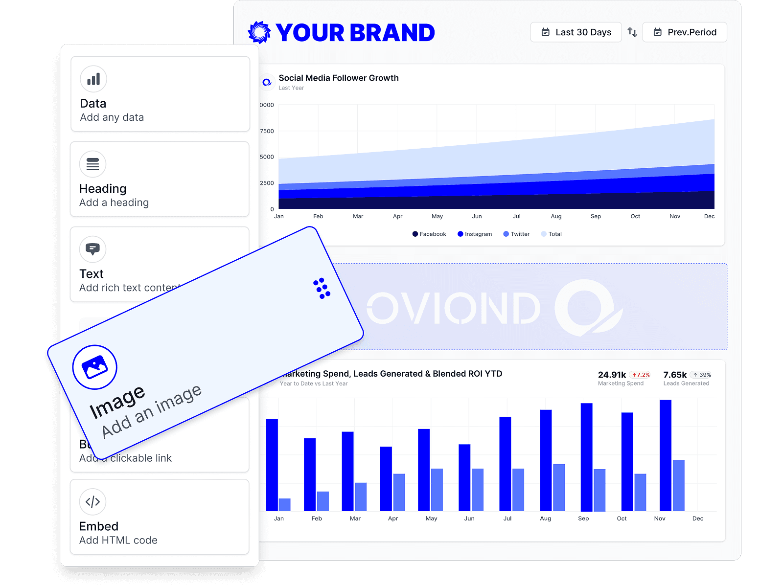
A reusable template saves the team from layout drift. For agencies, the useful starting points are usually the ones that already map to client work, like digital marketing, GA4, e-commerce, website performance, PPC, and social media ads. From there, the reporting lead can swap in the right KPIs, trim the sections that don't apply, and keep the brand consistent.
That matters because one good dashboard often becomes the base for the next ten clients. If the structure is sound, the next build is mostly replacement work, not reinvention. In agency terms, that means less time wrangling layouts and more time making sure the numbers match the client story.
Use reusable blocks for the parts that repeat
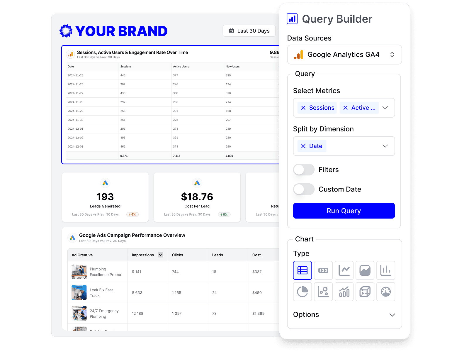
A standard client health summary block, a KPI row, and a notes section are all worth templating. So are custom queries, calculated metrics, and goals, because those pieces are what keep the report from becoming a screenshot dump. Reusable assets also help keep terminology consistent across clients, which is a bigger deal than it sounds when account managers are presenting the same metric in different rooms.
A practical build sequence looks like this:
- Pick the template: Start from the closest client category instead of a blank report.
- Connect the sources: Map the KPI list to the right systems before touching layout.
- Replace the brand layer: Swap logos, colors, and client-facing labels.
- Add calculations and goals: Use custom math and targets where the raw platform numbers aren't enough.
- Save as a reusable asset: Keep the block for the next client with a similar setup.
That workflow is what makes multi-client reporting manageable. Oviond supports prebuilt templates, reusable assets, custom queries, calculated metrics, and goals, which is exactly the kind of structure agencies need when they're cloning reports across accounts. The point isn't to make reporting flashy. It's to make it repeatable.
Scheduling, Automation, and White-Label Delivery
A dashboard isn't finished when it looks good on the inside. It's finished when the client receives it without someone on the team having to remember. That's the difference between a report that lives in a tool and a report that becomes part of the agency's delivery model.

Delivery has to feel like the agency owns it
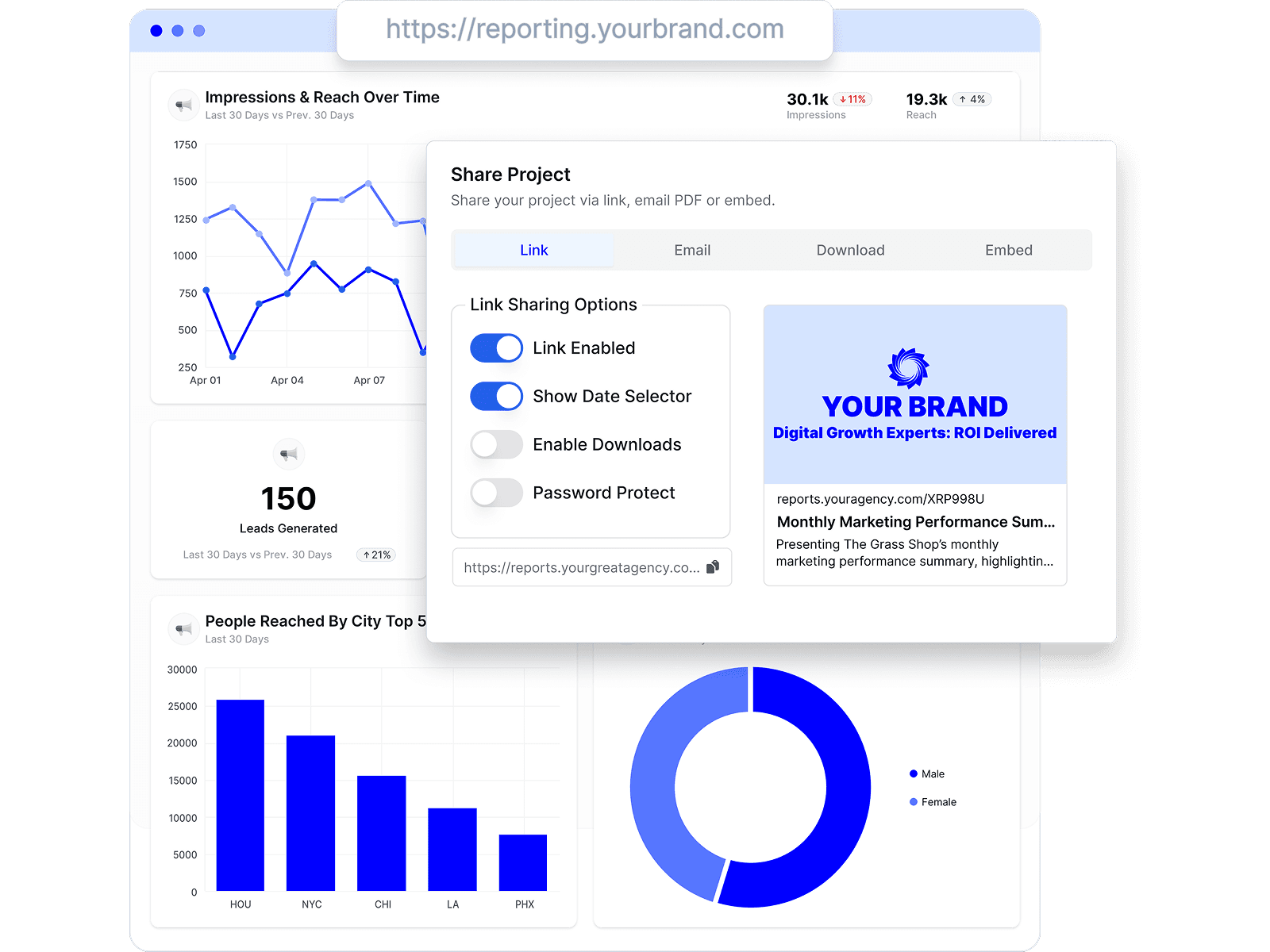
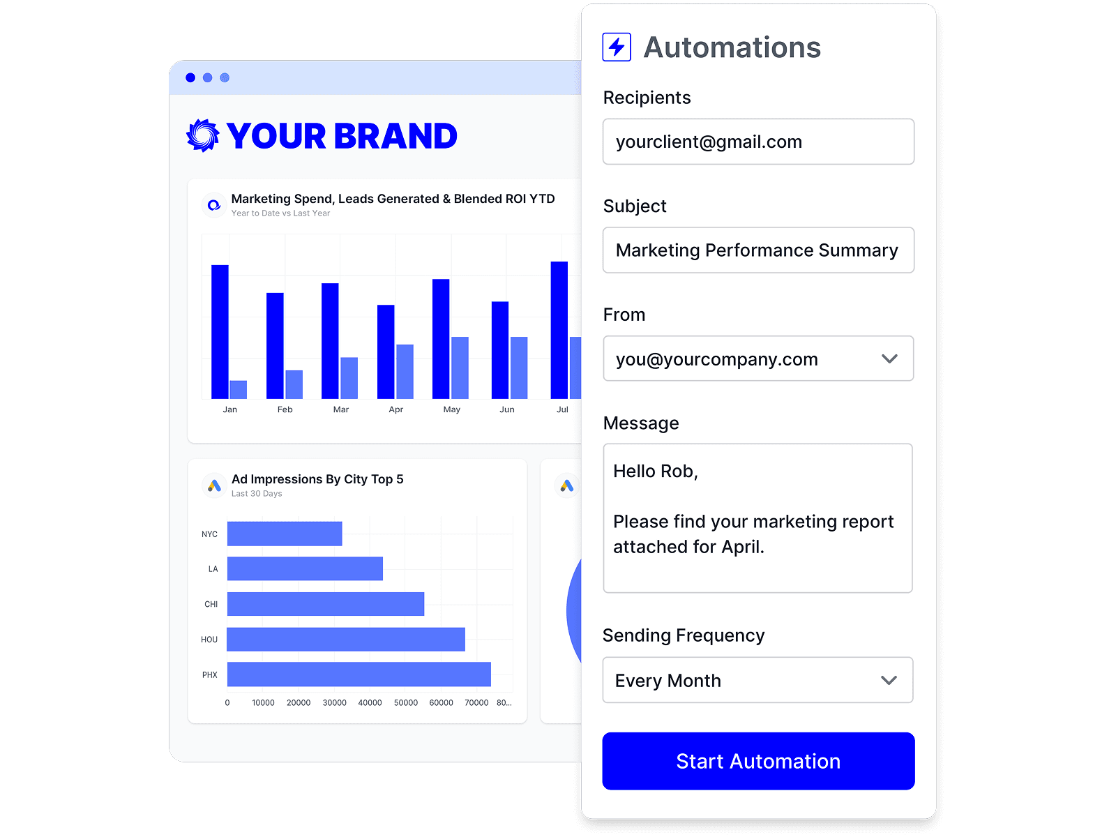
Scheduled email delivery is still the cleanest way to make reporting predictable. Some clients want the report in their inbox, others prefer a live link they can open when needed, and some need it embedded in a portal they already use. The agency should be able to choose the delivery path without changing the report itself.
White-label delivery is part of that experience. Custom senders, custom domains, and branded dashboards keep the client inside the agency's environment instead of the software vendor's. That's not cosmetic. It keeps the client relationship consistent and makes the report feel like a service the agency built, not a tool it rented.
One useful example outside marketing is automating applicant matching for startups, where automation turns a repeatable process into a scalable system. The same logic applies here. Once delivery is automated, the agency stops rebuilding the same update every cycle.
Automation is the scaling lever
Manual exports create stale data, version confusion, and extra Slack pings. Automated refresh and delivery cut out that churn. They also give the team a cleaner operating rhythm, because fast-moving paid media can be monitored with alerts while slower metrics can stay on a weekly or monthly review cycle.
That cadence matters. Not every KPI needs constant attention, but critical anomalies in paid media do need faster eyes on them. A well-run agency dashboard uses always-current data where it helps and scheduled review where it keeps noise down.
For agencies that want recurring delivery instead of one-off reporting work, the automation layer is the key. Oviond's automated reporting setup is built for that routine, with scheduled delivery, branded reports, and the option to keep the client-facing experience under the agency's name.
How Oviond Compares to Other Agency Reporting Tools
Agencies usually compare these tools on the same few questions. Can I white-label it cleanly? Can I handle multiple clients without rebuilding everything? Does the pricing punish growth? Can my team use it without a long setup spiral? Those are the right questions, because reporting breaks down in daily operations, not in feature lists.

The practical comparison
Looker Studio is attractive when a team wants a flexible reporting canvas and doesn't mind assembling more of the workflow by hand. It works well for Google-heavy setups, but agencies often end up spending extra time on maintenance, layout consistency, and client-facing polish.
AgencyAnalytics, Whatagraph, and Swydo each fit agencies that need multi-client reporting and branded delivery, but they differ in how they package the experience, how much setup they expect from the team, and how pricing scales. Some agencies want breadth, some want simplicity, and some want a more guided workflow with less tool sprawl. The right choice depends on whether the team is optimizing for speed, polish, or operational control.
Oviond sits in the agency-native lane. It combines white-label client reporting, custom domains, automated delivery, templates, reusable assets, 60+ integrations, and unlimited reports and dashboards in a single plan that scales by client count. It also includes unlimited users with no per-seat fees, plus human support and full migration assistance from the smallest plan. Those details matter because the cost of reporting isn't just the subscription. It's the time the team loses every time it has to rebuild the same work.
| Tool | White-Label Depth | Multi-Client Workflow | Integrations | Pricing Model |
|---|---|---|---|---|
| Oviond | Strong | Strong | Strong | Single plan, scales by client count |
| AgencyAnalytics | Strong | Strong | Strong | Agency-focused subscription model |
| Whatagraph | Strong | Strong | Strong | Platform subscription model |
| Swydo | Solid | Solid | Solid | Agency reporting subscription model |
| Looker Studio | Basic to moderate | Mixed | Strong with Google stack | Free tool, setup and maintenance vary |
When to pick what
If the agency is living in spreadsheets and needs a cleaner first step, Looker Studio can be a practical bridge. If the team already wants a more purpose-built agency reporting setup, the agency-specific tools make more sense. If the pain is recurring delivery across many clients, template reuse, white-label output, and hands-off scheduling matter more than a blank-canvas builder.
A sane rollout this week looks like this:
- Pick one client: Use a live account instead of trying to redesign the whole agency at once.
- Define five to seven KPIs: Keep the view tied to decisions, not vanity.
- Connect the right sources: Map each KPI to its actual system of record.
- Build from a template: Don't start from scratch unless you enjoy repeat work.
- Schedule delivery: Make the report arrive on its own.
- Review after the first month: Remove anything the client doesn't use.
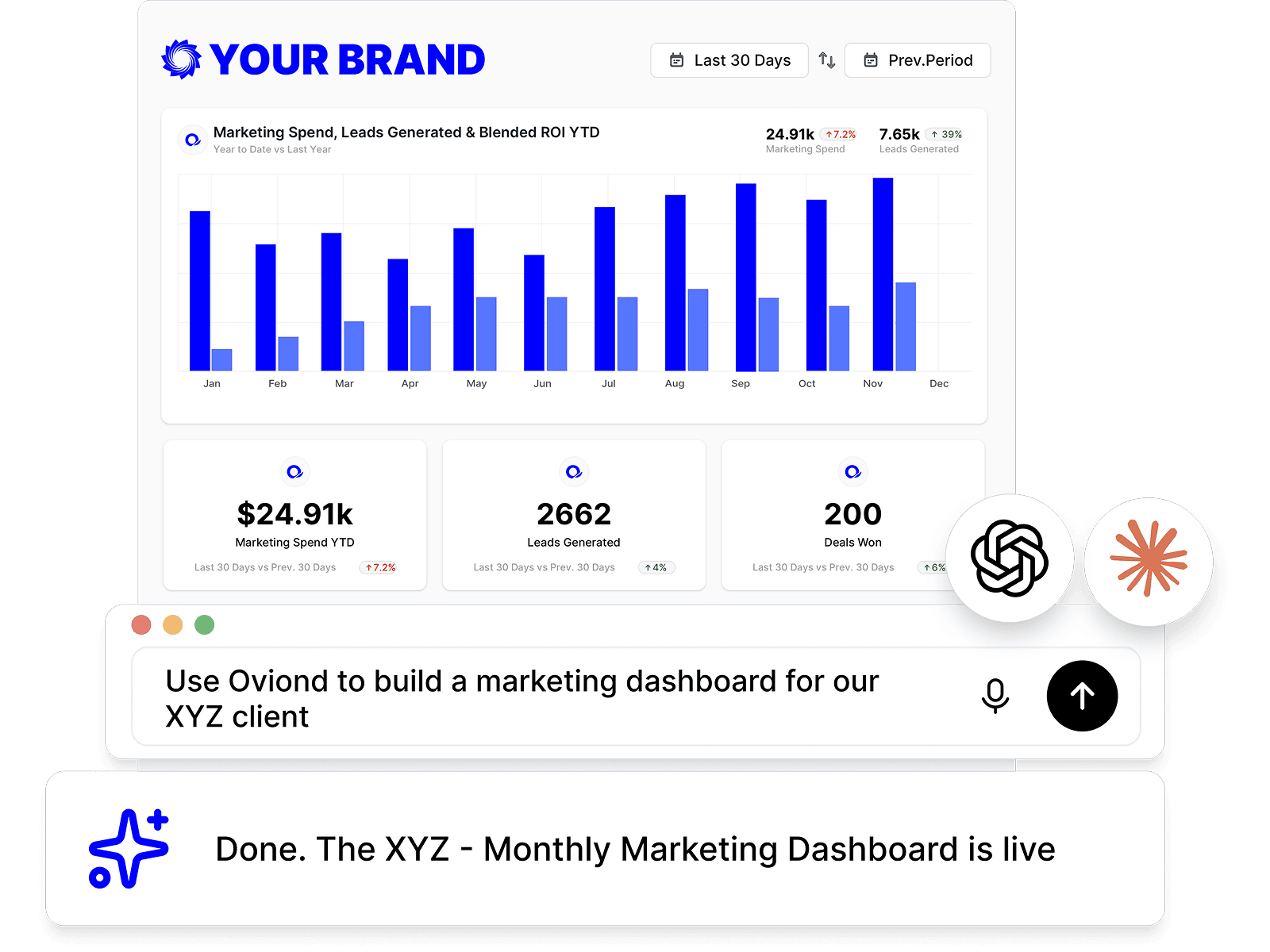
That's where the category is heading, too. Agencies are starting to use AI-assisted and MCP-assisted setup through assistants like Claude or ChatGPT, plus on-platform AI for summaries and insight notes, which should shorten setup without taking away the agency's job of deciding what matters. The tools are getting faster, but the reporting strategy still has to come from the agency. That's the part that keeps the whole thing useful.
If you're rebuilding agency reporting and want one place for branded dashboards, automated delivery, reusable templates, and multi-client setup, take a look at Oviond. It's built for the reporting grind agencies live with, not just for pretty screenshots. If you want client reporting that finally feels simple, start there.
Related articles
Simplify marketing reporting today
Stop juggling multiple tools. Start presenting clear, automated reports your clients will love